Flower Power Winners for Hampton Classic Table Settings
By Jill Brooke
It’s not only horses that are competing at the Hampton Classic Horse Show in Bridgehampton, New York.
This Grand Prix event, one of the most famous show jumping tournaments in the United States, has also become a contest for the prettiest table settings and floral arrangements.
Hostesses of the VIP tent tables are celebrated for their flair and creativity at this elegant event where celebrities, captains of industry and fashionable guests gather to watch the competitions and each other.
Because so many of the horse-loving participants have both exquisite taste and financial freedom – a powerful combo – it was difficult to choose which table settings would win our Flower Power Prize for the Hampton Classic Horse Show’s Tables Settings.
Here are the winners we chose as well as some of the runners-up. You might also be interested in reading about Carolyn Roehm’s advice to me about table decor. Admire these winners’ creativity and, hopefully, you can also learn and incorporate some of their ideas into your own home entertaining.
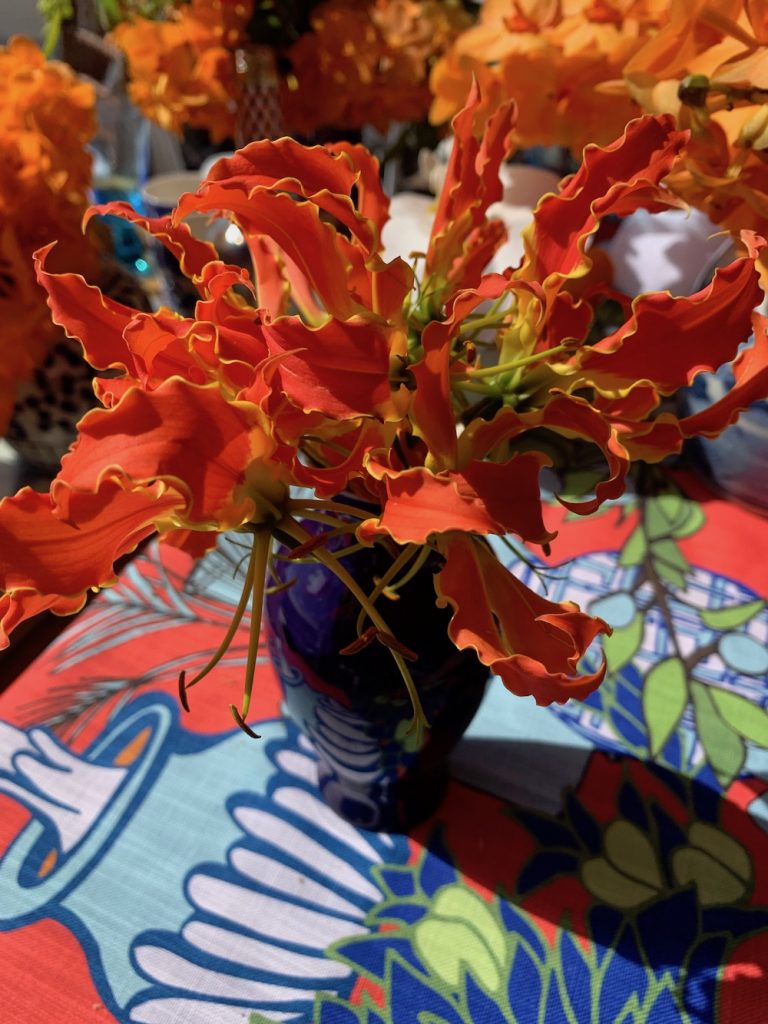
1) Michael Grimm and Jim Osburn’s Bridgehampton Florist
Michael Grimm and Jim Osburn of Bridgehampton Florist were asked 30 years ago to be part of the Hampton Classic and have done so ever since. They have never disappointed. When asked about their inspiration this year, Jim smiled and said it all started with this festive tablecloth.
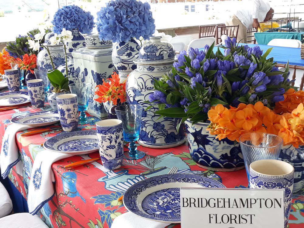
The Vanda orchids, blue Gentiana, orange single hydrangea blossoms and Gloriosa lilies were lush and seductive. I also liked how the team capped each blue porcelain vase with a pillowy blue hydrangea to great effect. It is an example of how vases can be used effectively. Another tip we can learn is how the team took bowls and vases – of different heights – and used bunches of the same colored flowers. It all coalesced to be festive, fun and interesting.
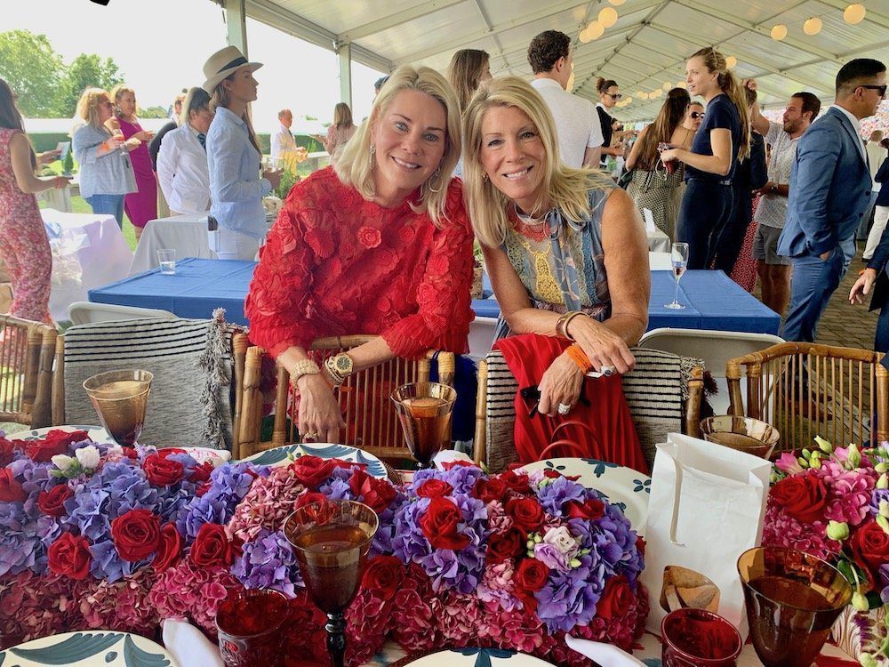
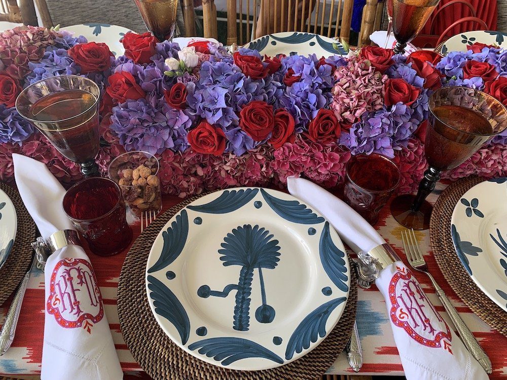
2) Sisters Kelli Ford and Kirsten Fitzgibbons of Kirsten Kelli
I can’t help but swoon over embroidered napkins with interesting designs. This talented Kirsten Kelli team, with offices in New York City and Greenwich, CT, hails from Texas and owns Madison, a popular Dallas store. They matched the napkins with graphic plates that picked up on the blue in the batik tablecloths. Then they used dancing ribbons of roses as colorful as rubies mixed with fluffy purple hydrangeas as the surprise contrasting color.
3) Château D’Esclans Whispering Angel
When you are the home of Whispering Angel rosé, as is Château d’Esclans in Provence, you think pink to be chic. The company hired Christy Doramus of CMD Creative floral and event design, who assembled an ethereal palette of pale pink roses, peonies and bold pink zinnias for a pop of color. She also found creamy white petal plates and placed mini bottles of the rosé inside individual porcelain gold-rimmed vases.
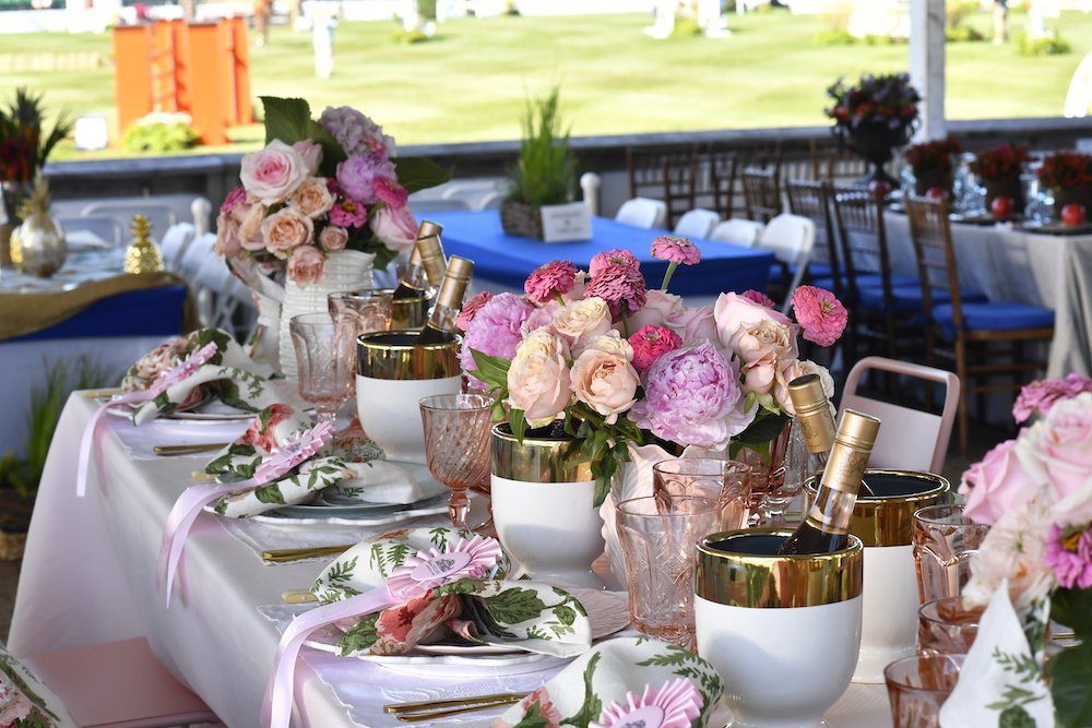
The pitchers filled with flowers are that perfect blush color that Tory Burch sells. Michele Wood, one of the company’s ambassadors, shared how Doramus’s mother sewed the napkins and seat cushions. Notice how lovely gold looks as silverware. They chose a modern pattern vs. something too ornate, which creates such a pleasing ambiance and also picks up on the vases. The overall impact was elegant, accessible and special.
4) Deana Hanson & Joanna Feffer’s Amagansett Flowers by Beth
Inspiration comes from many places. Joanna Feffer says the Golden Slipper event design team wanted something tropical as a way to point out that the Amazon is vital to our ecosystem. They hired Amagansett Flowers by Beth who used anthurium, Monastero leaves, Bromeliad plants and pink ornamental pineapples.
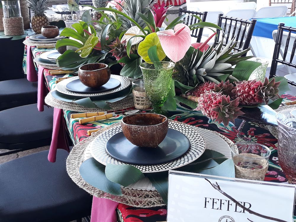
I liked how the plates and bowls were layered in a novel way and that the colors were vivid and bold. Notice how they used a banana leaf on top of the charger. It adds intrigue.
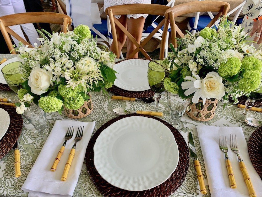
5) John & Stephanie Ingram Of Ingram Industries
The subtlety and freshness of this ensemble by the table sponsored by Nashville couple John and Stephanie Ingram really delighted me. John Ingram is chairman of Ingram Industries, which, for my bookish friends, might ring a bell. It’s the parent company for what used to be known as “Ingram’s” and is now the “Ingram Content Group,” which probably distributes more books, magazines and text books than anyone else in the country. The Ingrams paired the muted olive-toned tablecloth with floral arrangements of white roses, limelight hydrangeas, white cleome, big white cosmos and feathery astilbe tucked into straw vases. Natch the straw vases had the same tones as the silverware. Just lovely.
Here were other entries that also dazzled, for different reasons.
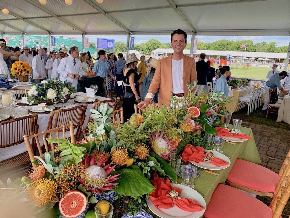
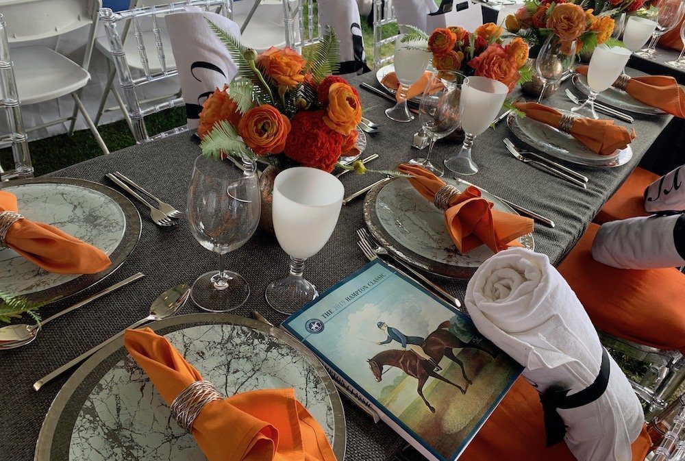
David Laks and Hannah Horvath (yes, that is her name; and they are both well known on the equestrian circuit) created a spirited table that was a feast for the eye. Because fall is upon us, they used orange tones to greet the season – as did many designers.
Not only did this team use large Protea in their design, but they also halved grapefruits and oranges to add color tone along with the greenery. This is a clever idea when you have to fill space without buying too many flowers. The bright orange napkins made it also feel sunny and happy.
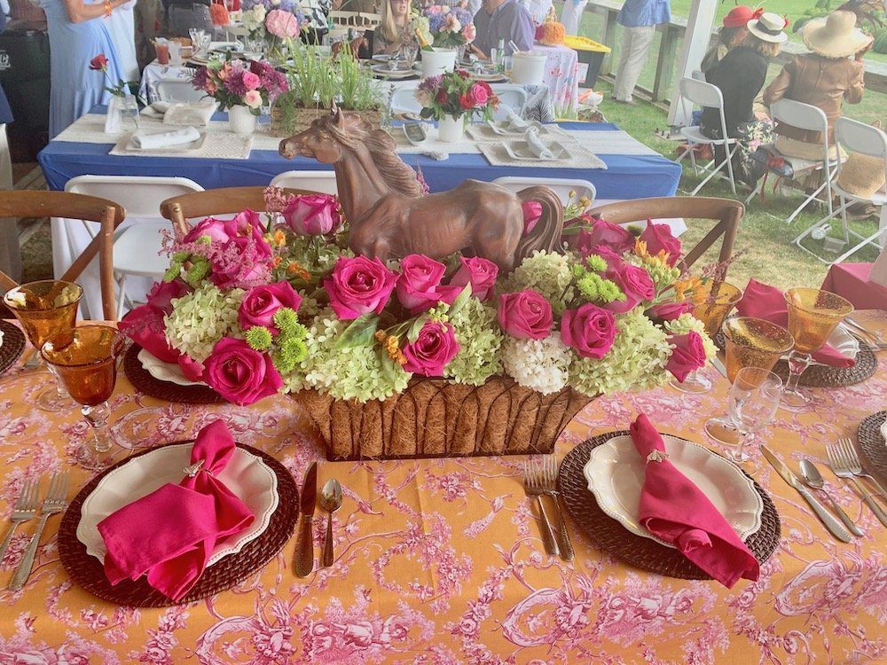
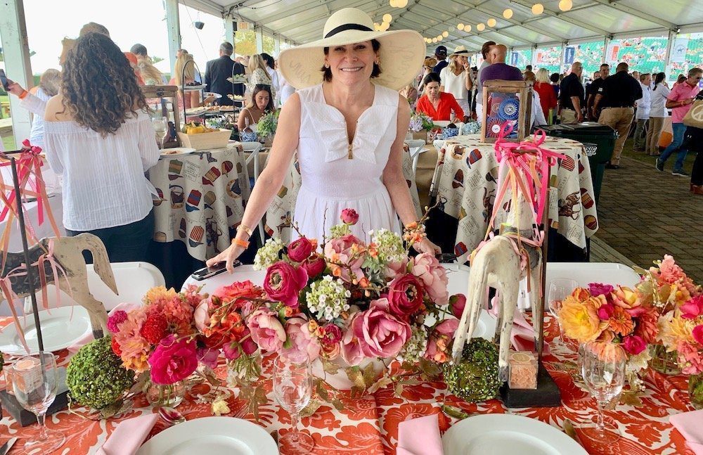
Artist Lisa Pevaroff worked the coral theme in inventive ways. I really loved the variety of densely rolled fresh flowers – as well as the graphic floral tablecloth. Not surprisingly, she is a painter and worked the tones to create a lively ensemble. A nice touch were the ribbons on the horse sculptures that book-ended the main floral arrangement.
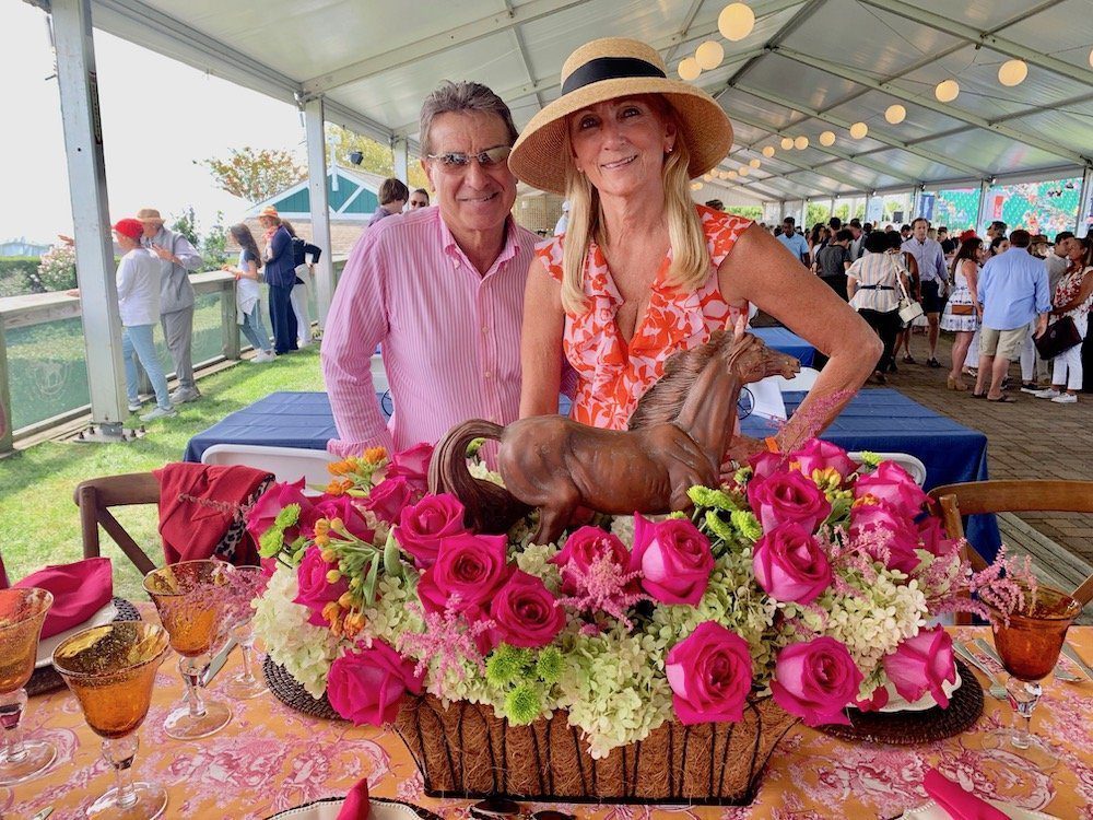
Laura Troffa – her husband owns the large landscape business in Setauket – used raspberry roses to complement her orange and pink tablecloth. I liked how she put a horse sculpture inside the floral arrangement. Simple but effective. It is again simple to think of using other objects on top of a floral arrangement for both height and individuality.
Instead of Palm Beach colors, the Corcoran Group’s table was modern and warm – a hard feat to accomplish. They used an orange theme matched with grey. Here the ranunculus charm as do the interesting veins in these white plates. Plain white plates would have been boring. The milky white goblets were a perfect addition to the overall effect.
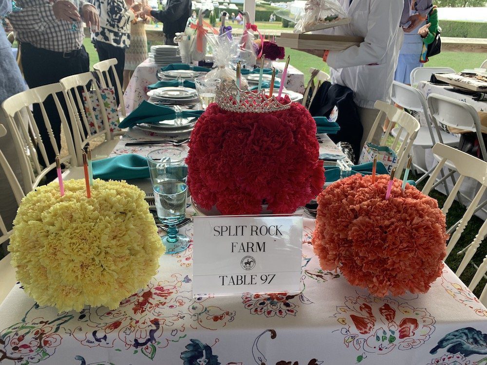
I liked the next table because it was inventive. The designers for Split Rock Farm put carnations around a foam ball and create a different type of floral effect. The Baccarat Hotel in New York does this with roses. It was colorful and fun. We, however, also consider the context of an event and thought it was more appropriate for a birthday party than the Hampton Classic.
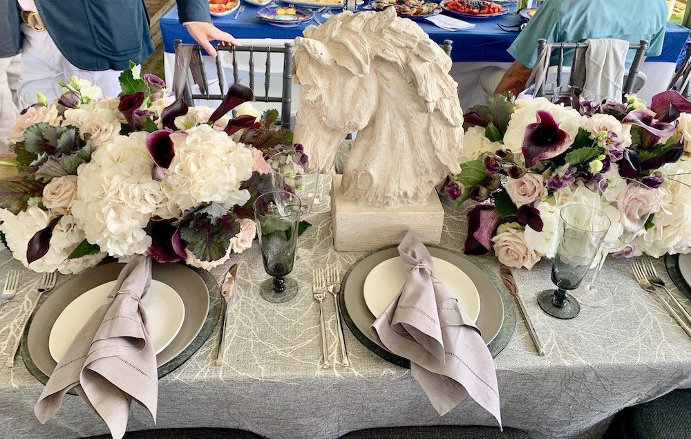
Sotheby’s table had a lot of eye candy. They used a horse sculpture as part of the theme. Using purple calla lilies inside white hydrangeas was also a nice touch. But to my eye, it was a little too bland. For instance, the pale lavender napkins were too well behaved for an event that requires such exquisite stamina, years of competition and remarkable bravery. This is, after all, a Grand Prix event, not a retirement party. A different tone or pattern would have elevated this into prize territory.
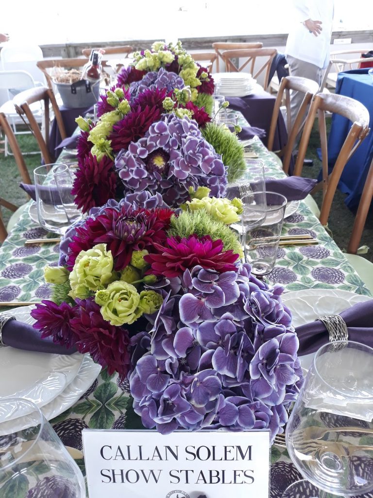
Callan Solem Show Stables used a purple palette but made it interesting with deeper violet colors. The white-trimmed lavender hydrangeas were exceptionally special. The raspberry dahlias also added visual punch. They also paired it with a lovely tablecloth that picked up the purple tones.
Tammi Capazzi wanted to make a statement that she wasn’t going to be too elaborate. “I wanted to keep it simple and be all about the horses,” she explained. Is less more? Not always. But a detail can be memorable. Use clear vases and put food in them to create an interesting design. Would I have liked to see more of these vases lined up on the table? Yes. In that case, more is more.
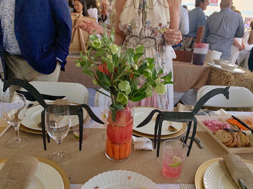
But there was a bonus prize. “After the lunch,” she says, “I’m going to feed the horses the apples and carrots.”
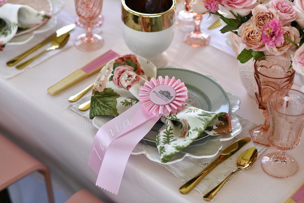
Photo Credits: FPJ for all images except Alden Corrigan for Chateau d’Esclans. Bridgehampton Florist, Callan Solem and Feffer were generously provided by Sharon King Hoge for C&G Media. The company’s local shelter magazine, HC&G, also had an overall table decor competition and was a sponsor at the Hampton Classic. As always, we look at the world through flowers so some of our results were different, though we both loved Chateau D’Esclans and Bridgehampton Florist as top tier winners.
Jill Brooke is the former on-air correspondent for CNN and editor-in-chief of Avenue, Show Circuit and Travel Savvy magazine.