Meet the Design Team Behind HBO’s Hacks – Now Emmy Nominated
By Jill Brooke

When you really want to diss someone, criticize their decorating choices.
That was the plot device used to create the tension between young comedy writer Ava (Hannah. Einbinder) and legendary veteran comic Deborah Vance (Jean Smart) in the hilarious recently renewed series, Hacks, which was just nominated for 15 Emmys.
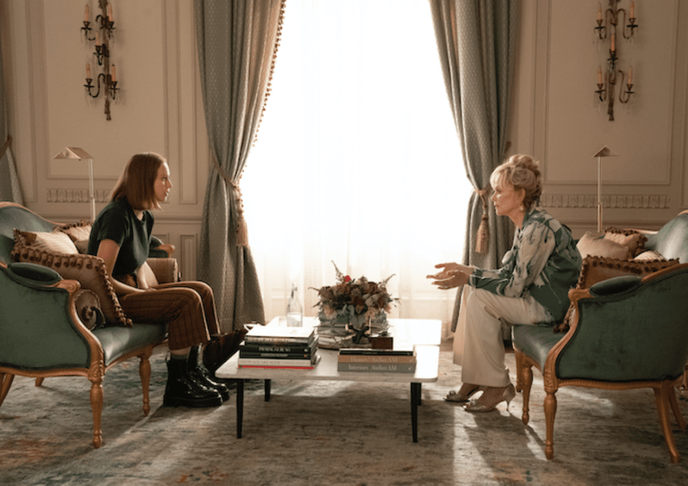
Down and out Ava flies to Las Vegas for a gig to apply for a job she doesn’t want at the massively-sized home of Deborah Vance. Upon leaving after Vance shows little interest, telling her to get her dirty boots “off my silk rug,” Ava fires back that the house looks like “a Cheesecake Factory” and what is it with “50 tassels on the couch.”
Of course, that was comedy gold for production designer Jon Carlos and set decorator Ellen Reede Dorros, who most recently worked together on the award-winning HBO’s Westworld series.
“We really leaned into the pillows for tassels,” says Reede Dorros, “We had boxes of trim and tassel samples and searched long and hard to get them. There was incredible detail that was intentional. They were monogrammed pillows in gold with a DV logo. It wasn’t garish so could stand out but not too much.”
They also put tassels on curtains as well as “the umbrellas by the pool” and in her daughter DJ’s room.
Production designer Jon Carlos realized that “seeing it from a young 25 years-old’s eye, with tassels on things,” would create “generational misinterpretations.” And that push pull also took place between them on what both considered funny and relevant.
An easy tactic for Carlos and Reede Dorros would have been to put tassels and elaborate trim on everything from couches to ottomans and make it look more like a tacky ode to Liberace and Elvis vs. a sanctuary for a complicated brilliant woman who had bravely risen through the ranks and was still trying to stay employed and relevant.
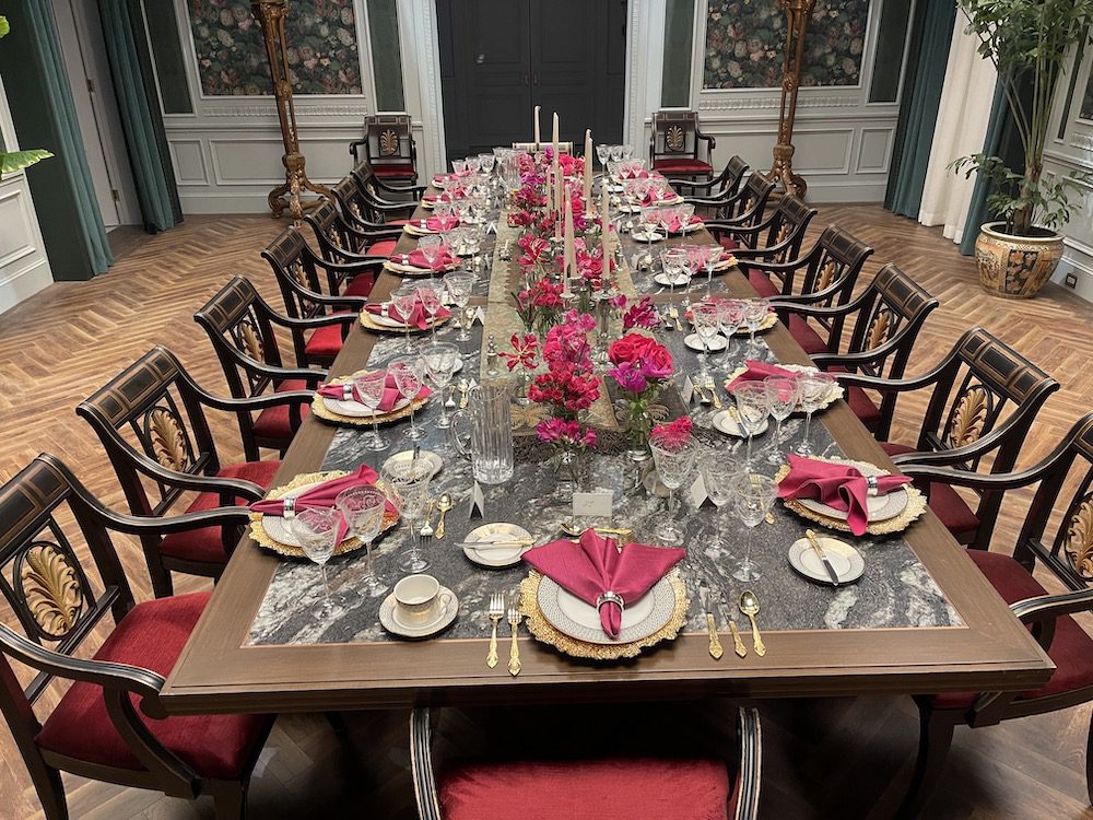
But instead, Carlos created luxe glamour that was spacious and tasteful. Because everything about Deborah Vance inherently is about quality and planning. Therefore, even the flower arrangements by Flowermaid’s Ines Garstecki were abundant and high-end.
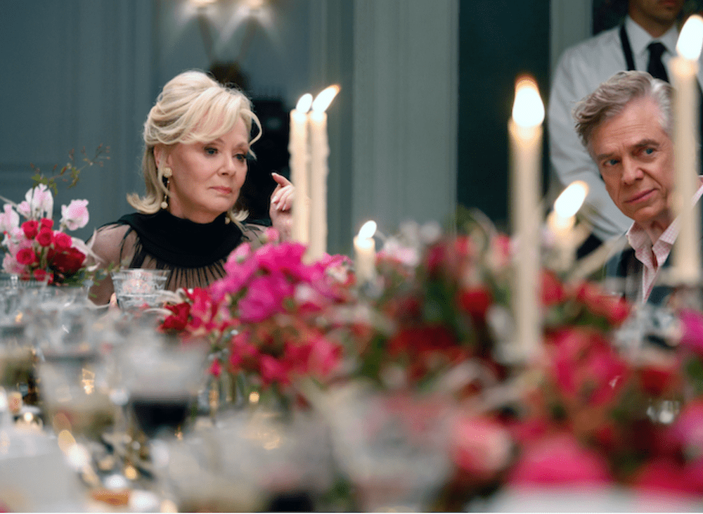
In a pivotal dining room scene, Garstecki mixed hot pink and red flowers including “hyacinths, anemone, freesias, gloriasas, veronica, sweet peas.”
“For the hallway where guests arrived, we added dyed hot pink pampas grass into the arrangement of hot pink flowers.” she adds.


However, to root the series in its very Las Vegas location, elaborate art nouveau gold trims can be seen on hallway mirrors as well as the choice of color for Vance’s kitchen stools and even sconces and an antique gold clock.
Another pivotal design scene is when Ava must acquire a special 1950’s salt and pepper shaker from a reluctant seller. Proving that Ava has a little Deborah in her, the young failing comedy writer desperately threatens to destroy a priceless vase unless he sells the rare Jean Royère porcelain prize.
Watching Deborah gently put the antique Royère pepper shaker into her tall beautifully-lit kitchen cabinet is a scene where you feel her loneliness as well as how possessions are hard-earned and valued.
The team searched Ebay and other sites to get a range of salt and pepper shakers.
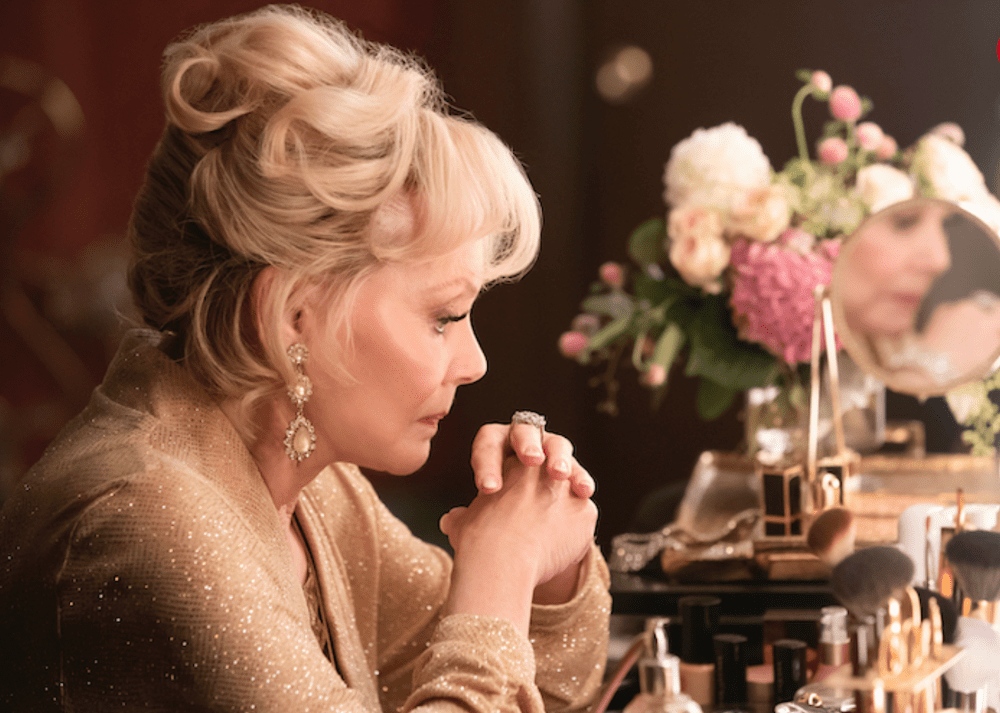
One of the hardest pieces to find was the vanity table in Vance’s dressing room.
“We wanted one vanity table but it was on back order,” recalls Reese Dorras. “Another was price prohibitive. So we found a lesser expensive one and created custom edges.”
“The is her public face and we got to make that room a little bolder,” adds Carlos. “There must have been 17 paints on the walls with crust underneath so it looked like applied make-up.” And the circular mirror was just pitch perfect with the globe lights.
Luckily since they were designing on a budget and also during Covid, they found a great selection for this room by Devon and Devon as part of the Zelda collection.
Speaking of public vs. private, the contrasts the team found between the home sitting room – where she originally meets Ava – and her office next to it speaks volumes about Deborah Vance’s character. The hard-edged couches aren’t inviting or cushiony like the coral one in the caramel wood-paneled office that also has contemporary art as well as a vintage mid-modern coffee table designed by Kho Liang Le.
One can see Carlos’ previous incarnation with “Mad Men” in his love of mid-modern pieces and custom-made smoked glass on tables including the office desk.
At this point, animal prints are a key symbol for strong take-charge women which is why they populate so many rooms. Deborah Vance has one in this office.
Anyone who lived in New York and went to Gino’s, the Upper East Side Italian eatery, may also recognize how the character Kiki had the Scalamandre iconic zebra wallpaper in her room. What a nice touch.
Another room had a gorgeous lacquered green sage color – which almost looked like teal- a popular color that many are using for sets ranging from “The Undoing” to “The Queen’s Gambit.” It is also now a color that is trending in people’s homes around the country.
While the exterior of the house was from a house under construction at a Los Angeles neighborhood, the rest of the interiors were created on a Paramount soundstage.
Carlos has said that he was influenced by the interiors by architect William Hablinski, who is known for taking large historical architectural elements and combining them with modern lifestyles and L.A. based Atelier AM, whose interior books are on Vance’s living room coffee table. Another influence was the United States French Embassy in New York for its use of ornate heavy furnishings and velvet curtains. That detail makes the room and its resident seem powerful but Carlos and Reese Dorras found softer colors in beiges, taupes and ivory to show her feminine side as well.
The flower choices also helped soften and reveal Vance’s tough character. Ines of Flowermaid let flowers tell stories.. For her office, Vance has a vase of pale pillowy pink and raspberry peonies on her vanity which shows how delicate and vulnerable she has become.
During a major dining room scene for her daughter’s birthday party, Ines mixed bold reds and dark pinks that showcased Vance’s stylish black dress so beautifully. Although the flowers were always present and tasteful, Ines did use many pointy shaped flowers like plumosa ferns to show both softness as well as a tightly-wound proud character.
Collectively it all worked and created a set that made a visit with these characters both memorable and enjoyable.
As Deborah Vance once states, “good is just the baseline. Great means you are lucky and work harder.”
 Photo Credit: Anne Marie Fox/HBO Max
