Fleurs de Villes 2023 Voyage Show Stirs Flower Explorations
By Jill Brooke

Be inspired to travel the world at Hudson Yards in New York City with the newest Fleurs de Villes Show.
Some of New York’s most talented florists have created 10 ft. flower-infused installations inspired by iconic destinations that are free for the public to enjoy. Plus the “Voyage” show is a perfect place for special Instagram moments. Last year the show’s theme was iconic women. The Voyage show will continue until Oct. 15th.
Although I was a judge along with Corrine Heck of Details Flowers, vote on your favorites. Casting YOUR vote can win a holiday in Bermuda at the @hamiltonprincessbermuda as well as social media contests with $500 gift card award.. Also, check out the free floral classes with some of these floral greats including Matt Norman.
Fleurs de Villes, led by Tina Barkley and Karen Marshall, is catnip to the flower-loving public and in the past four years has created 89 shows all around the globe.
Creating any of these installations requires days of work. Each flower is attached to a tube and delicately put into the mannequin so it lasts for 10 days. Manipulating shapes and considering colors as well as creating movement is all part of these talented florists’ challenge. Thousands of blooms are used for these creations to bring joy, merriment, and awe to the public.
Here are some behind-the-scenes details for 2023 Voyage Hudson Yards installations.
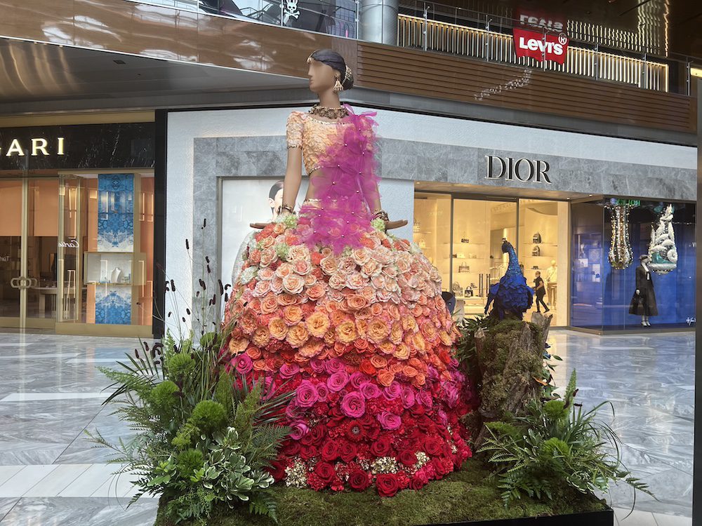
1). INDIA by Polycarp Flowers
Vibrant colors in waves of peach and pink roses, inspired textures, and floral details transport you to India with this incredible creation by Daica of Polycarp Flowers. This won for most creative and it is so beautiful to experience.
“I used roses for the bodice, along with hydrangeas and scabiosa pods for the skirt,” says Daica. “We wanted an ombre peach-to-red effect and used big open-faced garden-styled roses.” Anise was used for the stunning jewelry. In fact, Daica told us it took almost two weeks in the studio to perfect the delicate jewelry as well as the flow of the skirt.
And the scarf had the most interesting details. It was skeleton leaves and coffee beans, yes coffee beans for the flourish. (Italy also had beans used in this way for the skirt).
The peacock was also special. “A peacock represents prosperity in Indian culture so we have hydrangeas for the neck, rose petals for the body, and orchids for the tail.”

2) SPAIN by Serbio of Piropo Flowers.
Serbio created a fresh floral bullfighter blending historical heritage and artistic prowess, celebrating both the bold and the beautiful. Carnations were used very effectively on the pants, explained Serbio Uzcategui, noting the flower’s staying power.
Inspired by the iconic imagery of the bullfighter and the famous sculpture “Mujer y Pajaro,“ this vibrant floral mannequin melds the passion of the matador with the artistic spirit of the painting.
Notice how Serbio used yellow craspedia on the shoulder pads.
Originating as a form of ritualistic combat in the 18th century, bullfighting evolved into a celebrated spectacle, attracting people from around the world. It marries the bravery of the matador with the fierce spirit of the bull. The judges named this as the best of the show.
Notice how the floor is also a colorful explosion of colors and how the matador’s cape had different flowers on each side.

3) MEXICO by Picaso Flowers
Mexico is artistically brought to bloom by Picaso.flowers.
The skirt had roses and carnations popping out of it along with branches that created depth. A little splash of blue-dyed fern added style. The wax flowers as trim on the bodice was also pretty. The headpiece was an explosion of colors with the ferns branching out and the orange tight roses perfect with the red and yellow.
Makes you want to start preparing for the Day of the Dead which is coming up at the end of October.

4)PUERTO RICO by Lianna Nelson
This was such a happy installation. Light and whimsical and brimming with interesting flower choices. First, judges loved the delphiniums lining the base. The white-dyed ferns for the skirt added to the joyous feeling and the tree of life behind it in a burning red color added pop and intrigue. Oh and the addition of fishes and the utterly sweet and cute octopus charmed everyone.

5) SCOTLAND by Jennifer Design Events
Considering that Jennifer is a gold medal winner at the Philadelphia Flower Show, no surprise that her work dazzled. The Scottish bagpipes were wrapped in leaves with gold threads. And the kilt had a terrific color palate of pink and purple strips that still looked masculine. The fuzzy fern kilt in that violet shade really worked along with the beard made out of dried flowers.
“We created. our version of a Highland Scottish bagpiper inspired by our sponsor Hendrick’s Gin to appear to be coming straight out of a bottle of gin into the gorgeous land of Scotland,” says designer Jennifer Reed.
The flowers also came from Hoek Flowers which is a wonderful resource as well for florists along with Fern Trust Inc. Ferns are definitely fun to play with. DV Flora is also a source of flamingo wheat celosia which has such interesting textures.

6) ITALY by Gard Dirani
Check out the gondola filled with flowers. The boat was wrapped with dyed leaves. All the flourishes here were both festive and fun. The masked ball in Venice is so cool and I have had the luck of once attending. This installation captured the fun, especially in the detail on the blouse cuffs accented by baby’s breath flowers. Purple roses added to the color punch that complemented the purple plumes in the headpiece. Lots going on here and just wonderful to spend time looking at.
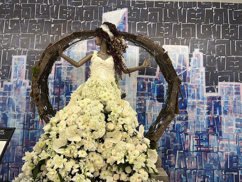
7) BERMUDA by Emy4Events
Owner Sherry Grimes Jenkins is as exuberant as this installation. Known for its pink beaches and turquoise waters, this Bermuda installation used so many white flowers to scream summer fun. Interesting how Whistler Canada’s installation used white hydrangeas to capture moving snow while Grimes Jenkins used the same flower placed to express calm. It’s all in the execution and expertise of the florist.
“The bodice took me a bit to design since she is a beach destination bride and seashells brought me back to every bride who loves a Bermuda beach wedding,” she says. Notice how the bracelet is delphiniums representing something borrowed, something blue.
8&9) PARIS and GREECE by House of Bernal

When the Paris florist had to bow out, House of Bernal came to the rescue with this installaiton. “We had to do this in two days!,” says Jennifer Bernal. But talent and skill prevailed. Furthermore, Rosaprima, known for its lush big roses, also came to the rescue with a delivery of red roses that were used for the cute mini skirt and of course, the beret. So French, right? The beret was rose petals. Maybe think of a project at home using rose petals to create art projects. And check out the little dog they created. Adorable.

For Greece, this goddess was so ethereal. Love how she used amaranthus for draping on the back. It is the best draping flower. While gold leaves were used for the crown, the theme of white worked well here too. Dyed white ferns were used in so many interesting ways. The tree offered a punch of pink to complement the vibe. Judges also really liked the shape of her hand which conveyed a girl with confidence and style. “We also created an aromatic herb garden with thyme and rosemary,” says Bernal. To illustrate the concept of the sea, she used “different shades of blue and at varying heights” as well as “quicksand roses representing the sand and white playa blanca roses representing the crashing waves.”

10) JAPAN by Yours Truly Flowers NYC
I was so charmed by this installation. The delicacy this floral artist uses in her everyday work was woven into this intricate installation. Simple but elegant. Pressed white leaves touched by a hint of grey made her kimono feel so authentic. She truly. found the perfect leaves with the right texture and design. The big black bow was also expertly crafted and designed. Notice how she used the black trimming as well to make this outfit pop. And then the lantern above the mannequin’s head? Just so lovely. It is just so peaceful to look at and brings you into Japanese culture brilliantly.
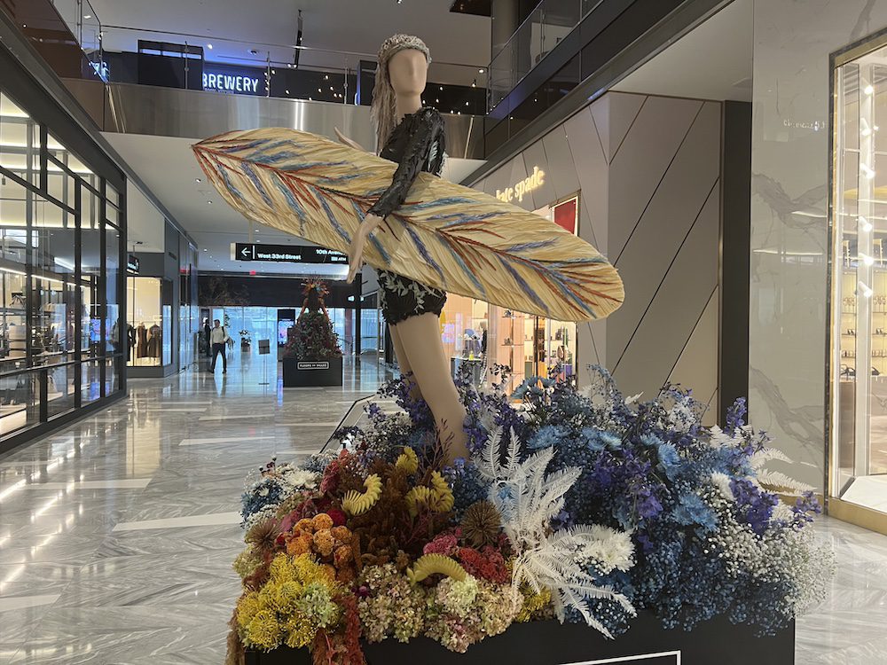
11) AUSTRALIA by Raven Haven Hollow
Swoosh. You just want to go for a ride with this installation. The surfboard with the fern leaves in blue was such a fun accessory to capture the spirit of this creation. Also, dyed fern leaves on the bodysuit were put together with the skill of a fashion designer. Of course, blue flowers were used to create a sense of the sea. But what really appealed to the judges was the endearing turtle.
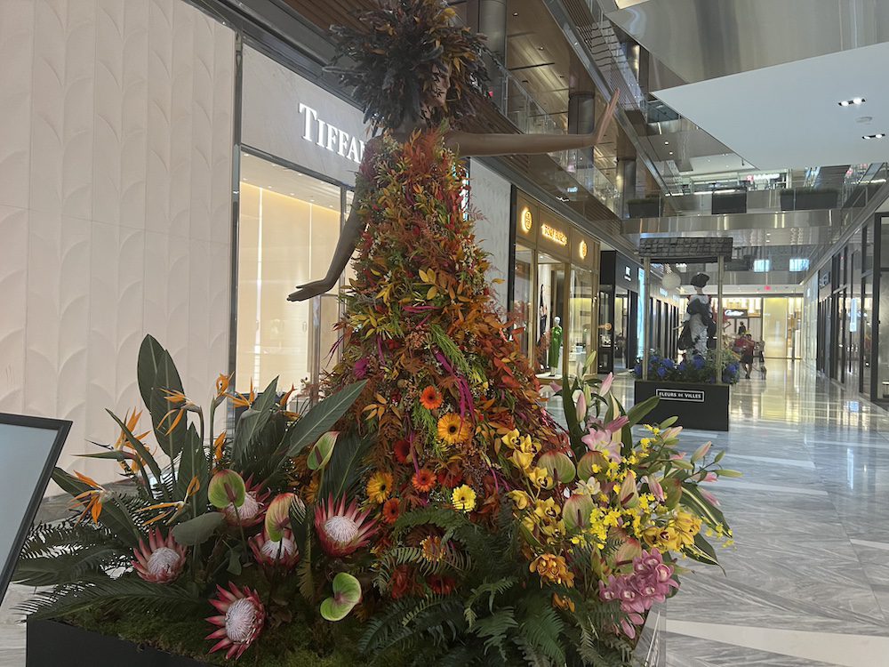
12) GHANA by Florals by Olga
This was an explosion of fall colors. It was so exuberant with flowers pulsating in all directions. Olga also used a nice flair with her choice of autumnal leaves. To emphasize tropics, liked how she used proteas in a variety of sizes. Plus her base used a lot of anthuriums which is such a trending flower. now and also comes in a rainbow of colors.

13) WHISTLER, CANADA by Lorenaeni Flowers
Lorena and her team used “white flowers to represent snow” in this installation. In fact, she had a wave of white hydrangeas, roses, dahlias, ranunculus, sweet peas and carnations to literally sweep up the mannequin’s snowsuit to represent skiing.
In the 1960s Whistler emerged as a world-renowned skiing destination and over the years, it has evolved into a premier winter sports haven, further cemented by hosting the Winter Olympics in 2010. With its abundant snowfall, challenging terrain, and breathtaking vistas, Whistler is a winter paradise that beckons adventure seekers from around the globe.
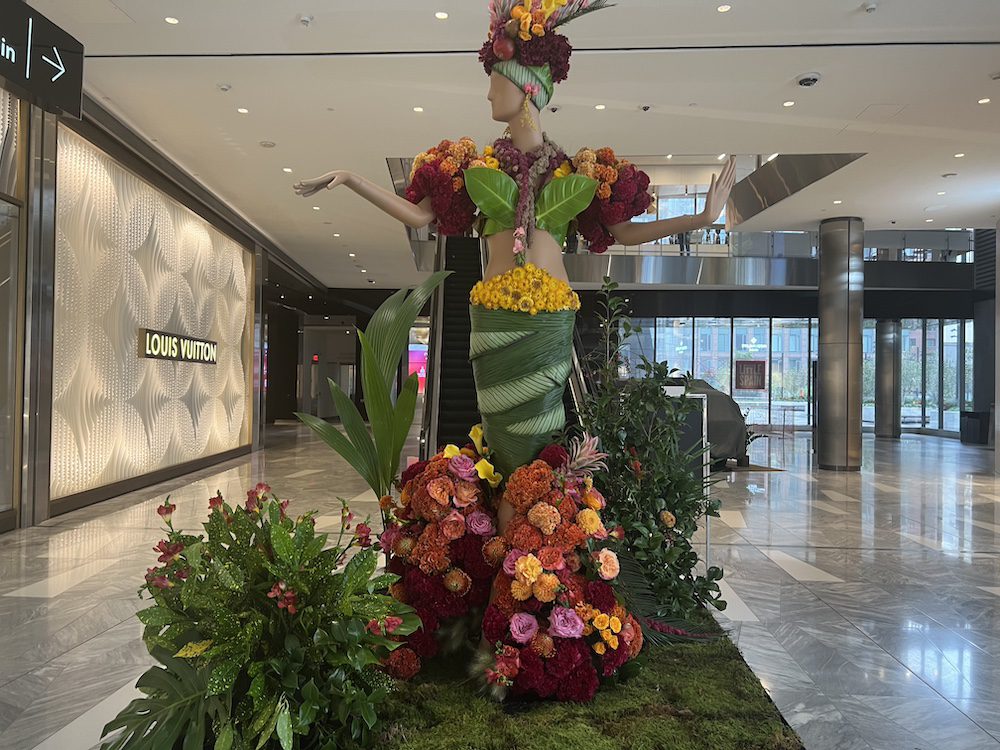
14) BRAZIL by Matthew Norman and Austin Blake Conlee
Who inspired this Brazilian installation? “Carmen Mirando,” says Matthew Norman. It definitely had a lot of chica chica boom. What an inspired installation full of leaves used as fans for the bodice and wrapped around the skirt. The flower selection was bright and happy too. “The celosia was used to add additional texture,” says Norman, who will be teaching free floral classes this week. We loved how the celosia’s garnet and orange colors added both texture and brightness to this fun installation.

15) CHINA by Stella Style Events
This lady was so regal. Most use colorful flowers for the headdress but here the team used gold straw effectively. That color wave also was infused throughout the traditional attire as a subtle but lovely flourish but made modern by the asymmetrical lines. Very well done in terms of strategy and execution. Also please look at how each petal on the dress is a different color and collectively it’s like a Seurat painting in that it all works. That is a reflection of true talent to mix so many colors and have it be seamless but interesting. No jarring color mistakes. Impressive indeed.

16). FLORAL BOOTH by Cecilia Hill Floral Design
This made every person want to call their travel agent to explore a new place. Kudos for making this telephone booth both whimsical and brimming with positivity and fun. The colors are not only happy but bright and cheerful. We have covered many phone booth designs in shows around the world and this one is my favorite. The little touches of animals and the hot air balloon were such an adorable flourish and reflected incredible talent and design skills. Don’t miss a detail on this beautiful display.
In fact, all these displays were beautiful. As Polycarp Flowers’ Daica said, “I think this was the best one ever.” And she should know. Daica is the only florist who has been in all four shows.
Jill Brooke is a former CNN correspondent, Post columnist and editor-in-chief of Avenue and Travel Savvy magazine. She is an author and the editorial director of FPD and a contributor to Florists Review magazine.
