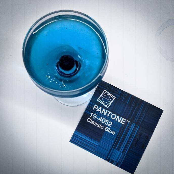
Classic Blue Has Been Anointed Pantone’s 2020 Color of the Year
By Jill Brooke
You can expect to see a lot of dusky blue next year.
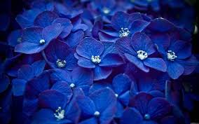
The Pantone Color Institute announced that its 2020 Color of the Year is Classic Blue, a shade that evokes “sky at dusk,”
“It’s a color that anticipates what’s going to happen next,” said Laurie Pressman, the vice president of the Pantone Color Institute, which selects the Color of the Year. Adds Leatrice Elseman, Executive Director of the Pantone Color Institute, “We are living in a time that requires trust and faith. It is this kind of constancy and confidence that is expressed by Classic Blue, a solid and dependable blue hue we can always rely on.”
Well, what is going to happen next is it will be a fun game to see how this color will populate – and pollinate – art, fashion, make-up, table settings, wallpapers, art, wellness, cocktail drinks, etc. as well as gardens and floral arrangments.
You can think of it as a gimmick – the Pantone team says it patrols all pop culture to see what’s becoming popular – or you can look at it as an opportunity. Yes, an opportunity.
As you know, we at Flower Power Daily look at the world through flowers because it makes everything happier, brighter and more interesting. We provide a burst of beauty through photography and then interesting knowledge learning about the flower mentioned. We do this all the time since that little tweak in our thinking can enhance and improve our joie de vivre.
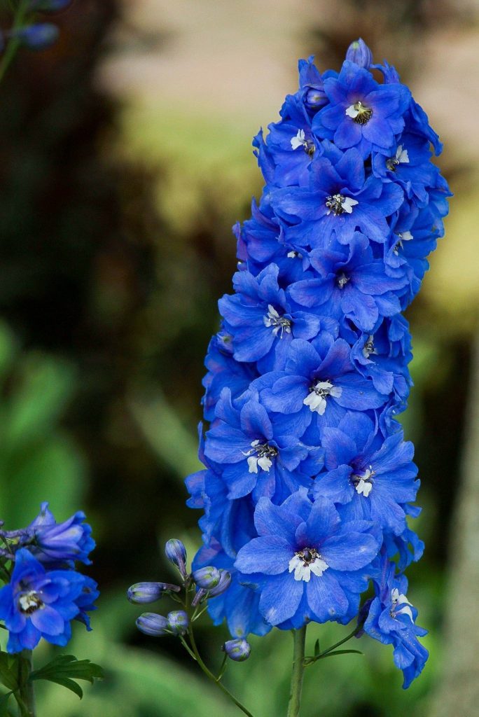
But with the color of the year being Classic Blue, you can now focus your lens to see how this color will impact your year. Already I’ve had a wonderful hour thinking of different flowers and floral products in blue like delphiniums – also known as larkspur.
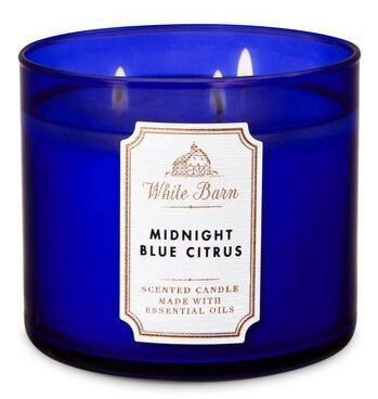
There is a candle by Bath & Body Works called Midnight Blue Citrus.
There will be bartenders creating drinks shaken and stirred to sample at restaurant outings.
And of course, decor wallpapers like this one from Eskipaper.com will be showcased as well as fashions.
Pantone has named a color of the year for more than two decades. Last year it was Living Coral and we certainly saw that color bloom in many flower arrangements, fashion choices and even in the “Downton Abbey” movie.
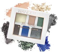
For Pantone to name this color now means that it is starting to surface in pop culture at this moment. It will just be even more so for all next year. Check out how the clever people at Drew Barrymore’s Flower Beauty already knew these trends were happening and introduced new products.

Can you find five things in your life today that is this color blue?
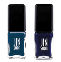
There are also these nail polishes from JINSoon. Maybe consider getting a blue manicure this month. I found an Akris shirt that I will now start wearing more.
And don’t think that this doesn’t matter. Remember how Meryl Streep (playing Vogue’s Anna Wintour as Miranda Priestly) schooled Anne Hathaway (Andy) in “The Devil Wears Prada.”
Streep’s character was agonizing over what color blue would be the right belt color for a shoot.
“OK, I see. You think this has nothing to do with you,” Streep sniffs. “You go to your closet and you select that lumpy, loose sweater, for instance, because you’re trying to tell the world that you take yourself too seriously to care about what you put on your back, but what you don’t know is that that sweater is not just blue. It’s not turquoise. It’s not lapis. It’s actually cerulean.
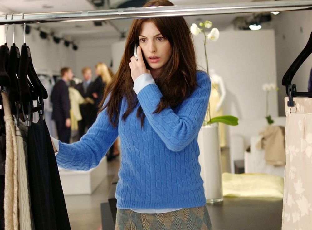
“And you’re also blithely unaware of the fact that Oscar de la Renta did a collection of cerulean gowns, and then I think it was Yves Saint Laurent who showed cerulean military jackets, and then cerulean quickly shot up in the collections of eight different designers. And then it filtered down through department stores, and then trickled on down into some tragic Casual Corner where you no doubt fished it out of some clearance bin.
“However, that blue represents millions of dollars and countless jobs, and it’s sort of comical how you think you made a choice that exempts you from the fashion industry when, in fact, you’re wearing a sweater that was selected for you by the people in this room.”
So before we mock any color trend, maybe we should embrace the work behind it.
It’s the trickle-down theory at its best. Furthermore, we are alive – lucky us – and have the ability to dive into trends with gusto for the fun of it.
Oddly enough, Pantone’s Color of the Year in 1999 was Cerulean Blue. “We were moving into Y2K and wondering is the world going to fall apart,” says Pressman, noting how this year’s color offers reassurance and confidence.
So now Classic Blue has been anointed the color for calm, contemplation and action. We all certainly need it. What a great way to embark into the New Year.
Jill Brooke is a former CNN correspondent, Post columnist and editor-in-chief of Avenue and Travel Savvy magazine. She is an author and the editorial director of FPD.