Kips Bay Decorator Show: Year of Monochromatic Flowers
By Jill Brooke
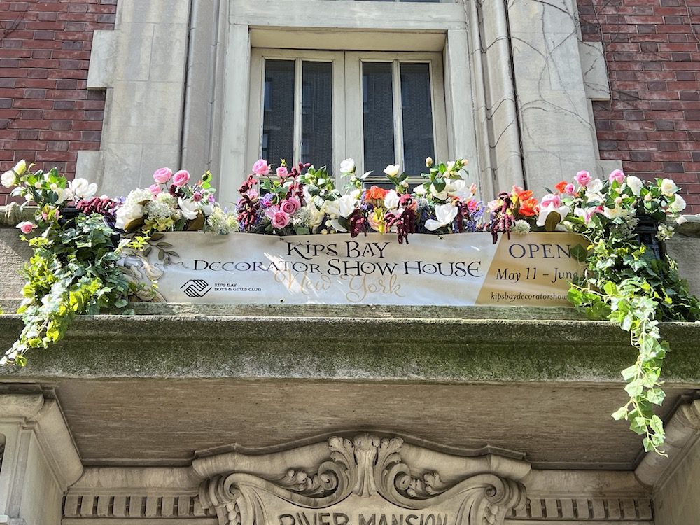
After a three-year hiatus, the Kips Bay Decorator Show House in New York was unveiled. Oh, what a joy it is. Flowers were blooming all over the historic Beaux-arts townhouse on 106th Street and Riverside. The reimagined interiors on all five floors were truly spectacular. One flower trend was many designers incorporated one flower choice and put them in clusters to enhance the rooms. The 22 designers collectively created a design experience you don’t want to miss. The show will be open through June 6.
Plus, the show raises funds for Kips Bay Boys & Girls Club and has already raised over $28 million for this worthy cause.
Here are some highlights and how the designers were inspired by flowers. And more flowers.
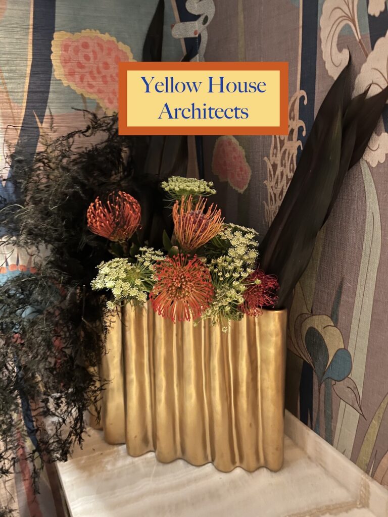
1) Yellow House Architects
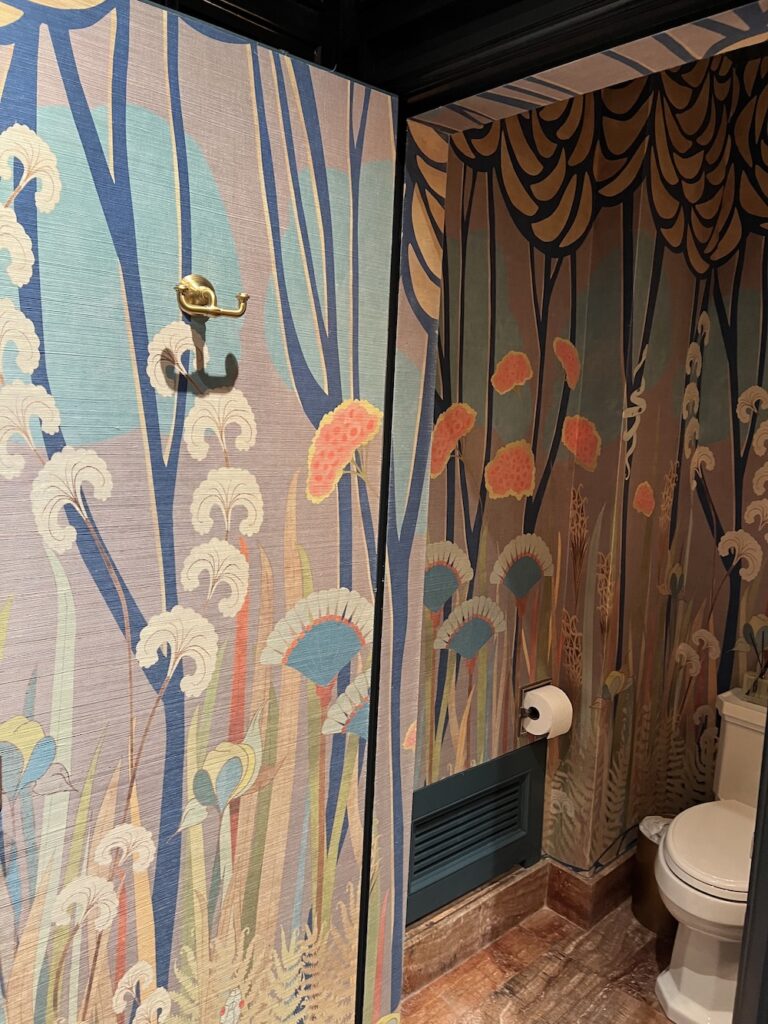
If you want to go bold with floral wallpaper, bathrooms are always the best place to be wilder and have fun. This botanical wallpaper is by Aux Abris. Furthermore, notice how Yellow House Architects’ interior design director Kristie Ollendorf matched the bold tropical orange flowers in the wallpaper with the protea in a super cool sculptural vase. This vase was a winner for sure.
And then in the hallway, just a few squiggly alliums – isn’t nature so amazing? – complemented a chandelier in the entrance hallway. Ollendorf has an eye for vases because, in this little hallway, she also found another way to use climbing alliums.
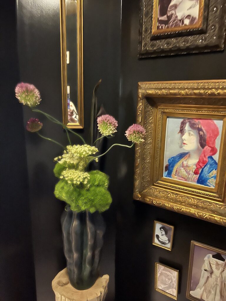
The charming clusters of artwork may be classic but the flowers created modernity. Furthermore, finding the alliums and other sturdy flowers like protea meant that the flowers can last throughout the whole show. Practical and creative always a good combo.
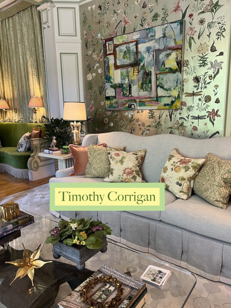
2) Timothy Corrigan
This designer is a fellow flower lover and decided to embrace what he calls “spring fever.” In fact, the oh-so-talented Corrigan told me the wallpaper is inspired by a 17th-century Flemish botanist. He created this wallpaper for Fromental and, as is so often with great design, it became the springboard for everything else. The pillows had similar insect embroidered trim and a David Duncan Studio chandelier had a custom snake design near it for cohesiveness. Of course, the coup de gras was the tulipiere.
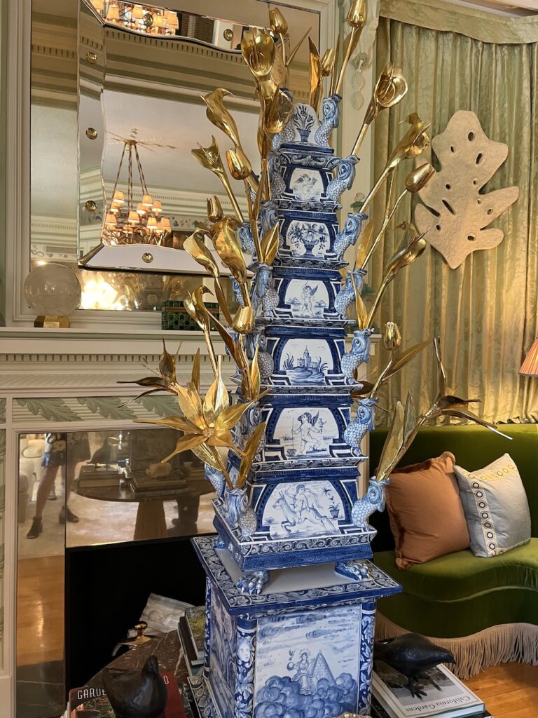
Instead of fresh tulips, there were gold sculptural tulips. After all, as he said, “In the 17th century, tulips were as valuable as gold.” So clever, right? There were other floral sculptures throughout this charming room and the modern painting matching the sparkling but serene wallpaper made the room both fresh and delightful as well as memorable.
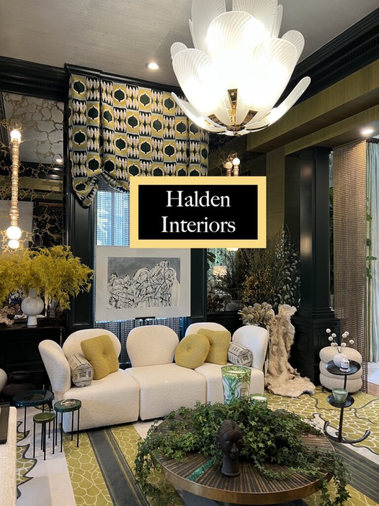
3) Halden Interiors
Kesha Franklin is a green goddess. She calls her incredible work the heart of the vine. Inspired by art by South African photographer Pietr Hugo, she used custom floral wallpaper whose white blossoms just burst with positivity and calm.
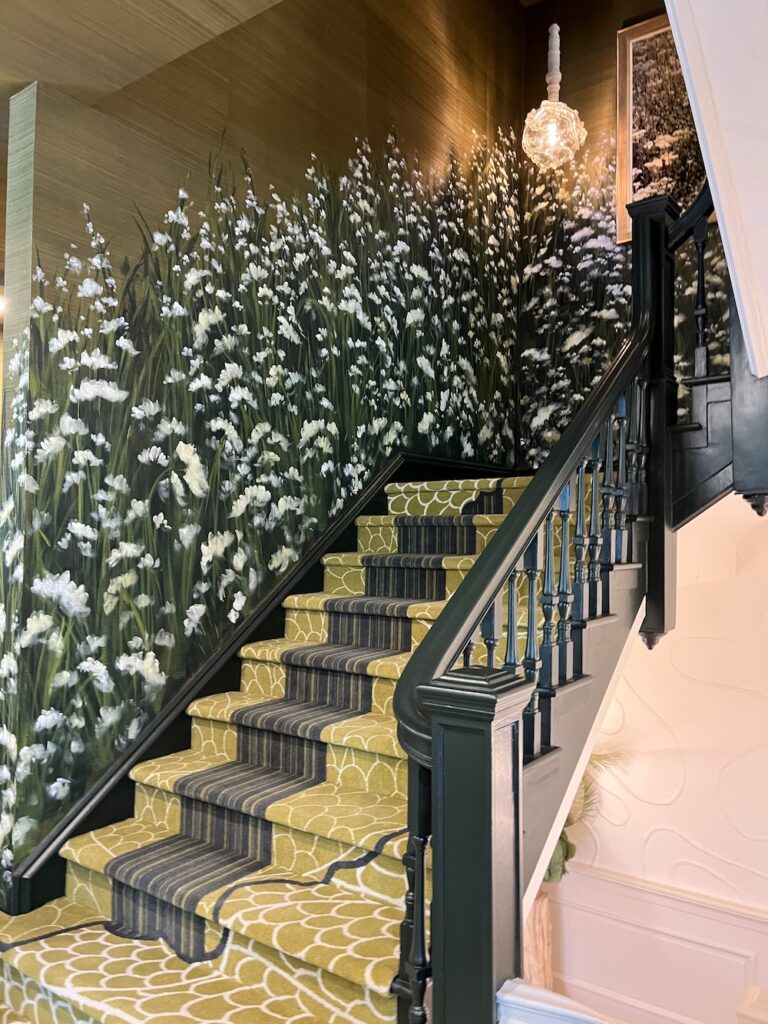
The botanical carpet was designed by her but somehow though bold, it was soothing and welcoming. Quite a feat. Furthermore, her hallway custom carpet was equally creative. She really created a fertile vibe here and love the color combos of mustard yellow and green.
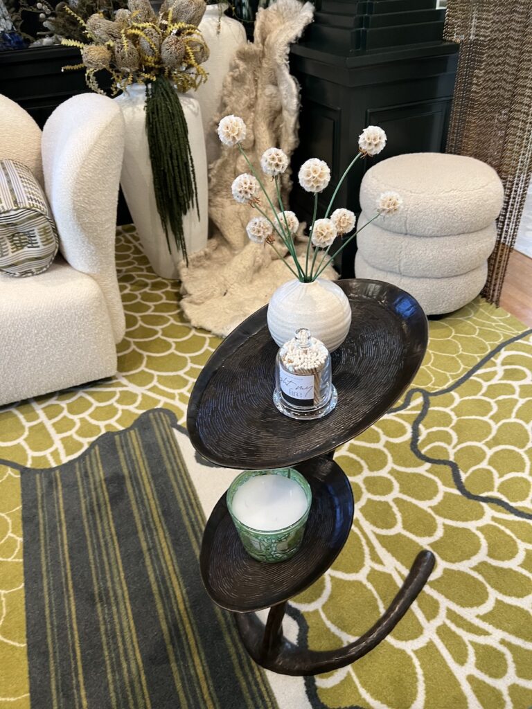
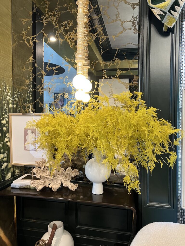
Also, the floral choices were inspired. Dyed yellow ferns in a white vase, ivy draping over a cocktail table, and dried plants in unexpected ropey shapes added to the overall earthiness and intrigue.
“We wanted to create a design a place that felt protected by the beauty of nature and that evokes passion,” she says. Mission accomplished.
4) Ghislaine Vinas
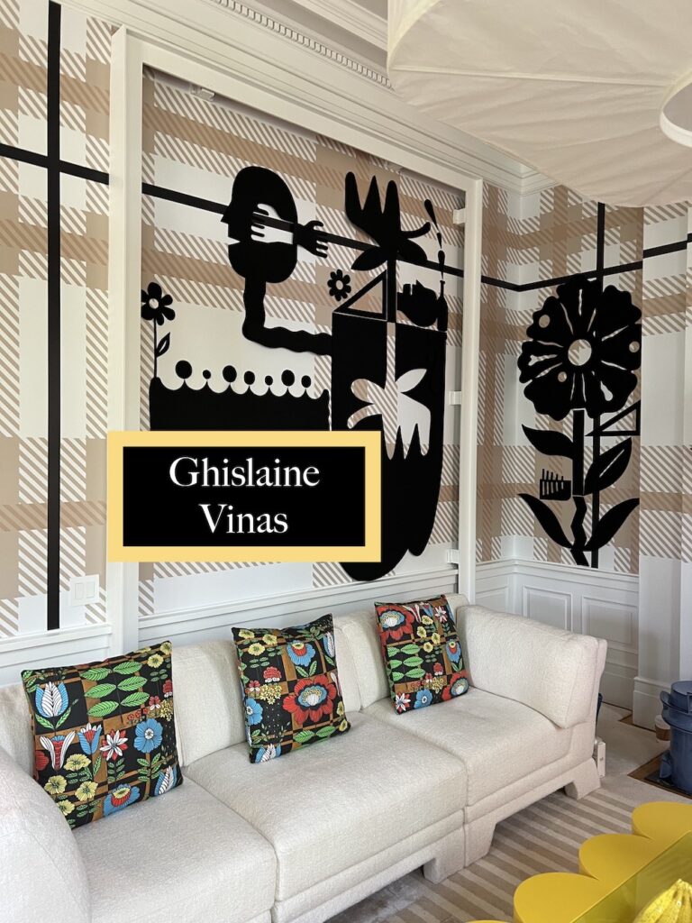
In this parlor, Ghislaine Vinas tapped into a fun trend which is putting floral shapes on the walls. (Floral sculptures and paper flowers also trending). Having this classic beige and white Wolf Gordon wallpaper and then adding the black bold flowers by Mark Mulroney was inspired. This allowed her to also add orange to the mix for a display cabinet which make this indeed a lively room.
5) Georgis & Mirgorodsky
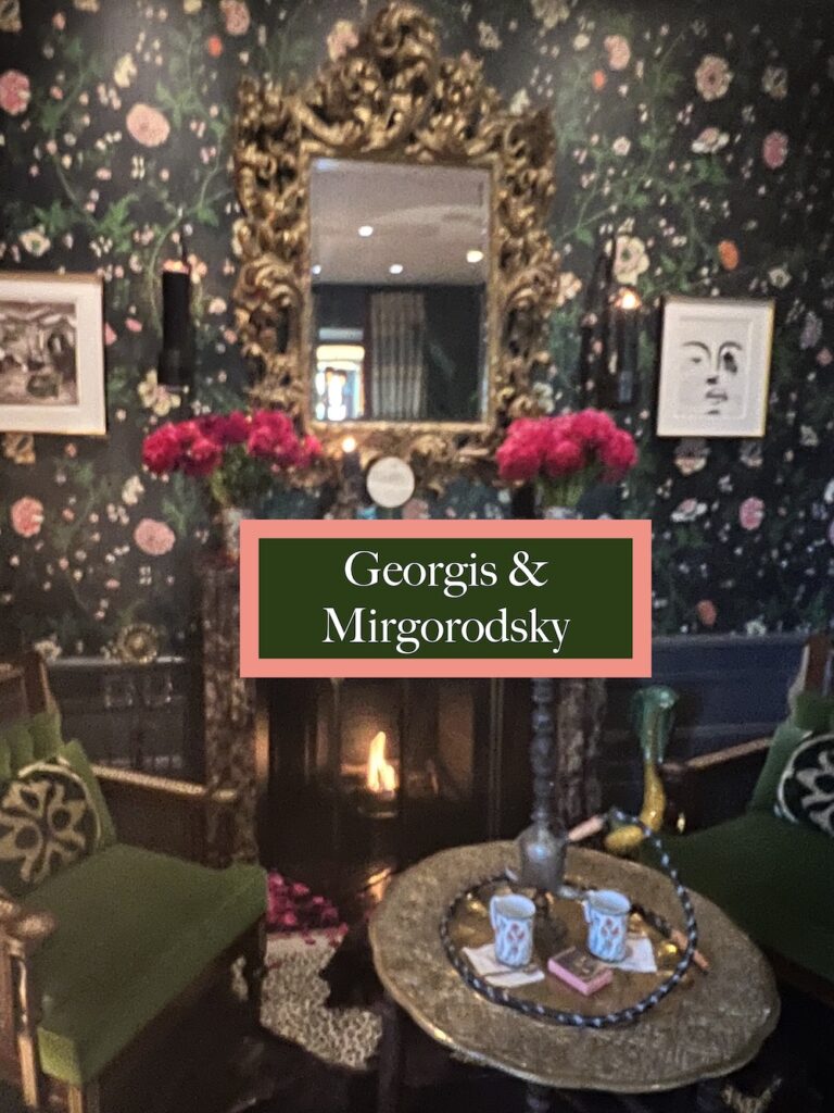
It’s a myth that florals are feminine. Here the designers created a sultry room where one can imagine men having conversations with glasses of cognac. In fact, says William Georgis, the room is inspired by Cairo and Istanbul. Notice the pink peonies and roses on the mantle, complementing the deep navy background for the floral wallpaper. And the plaid fabric for the curtains works so well.
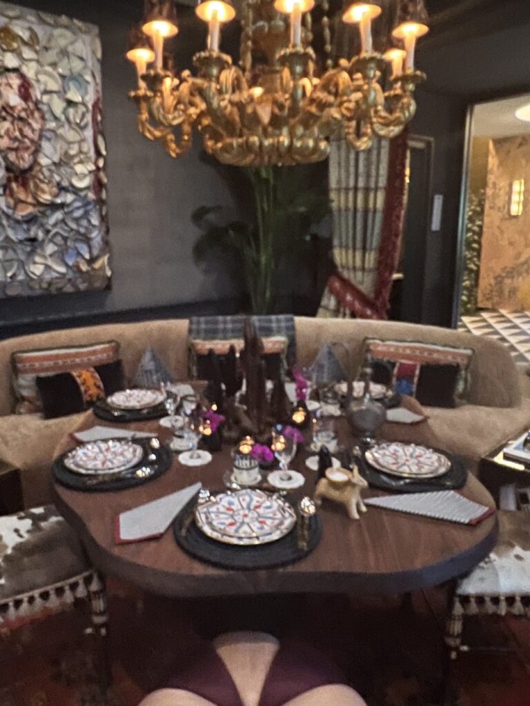
Further enhancing the vibe was the Maison Gerard sofa and the table next to it. Loved how he gathered small bud vases in black ceramic and put purple orchids in them. A great idea when you have an orchid plant and it starts to wilt. Cut off the healthy blooms and put them in bud vases for a dinner or gathering. The team purposely created a lower table that serves as both a dining room table and a coffee table, allowing someone to sit there for hours, with spaces to eat, entertain and enjoy.
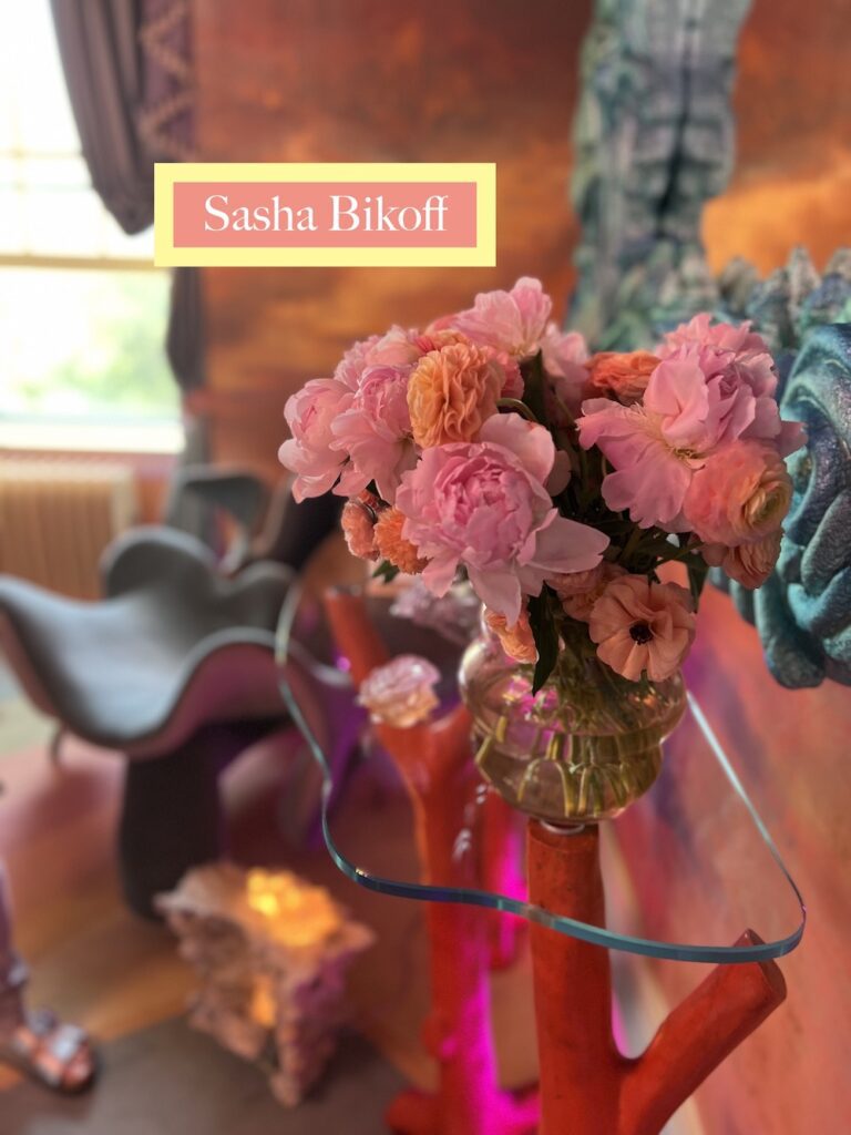
6) Sasha Bikoff
One of my favorite designers, Sasha Bikoff is a talent who dreams big and loves fantasy in both her floral designs and interiors. In fact, I met her at the Hampton Classic where she designed a winning tablescape.
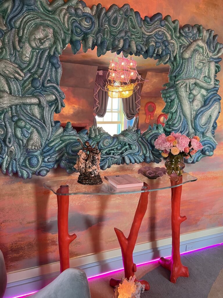
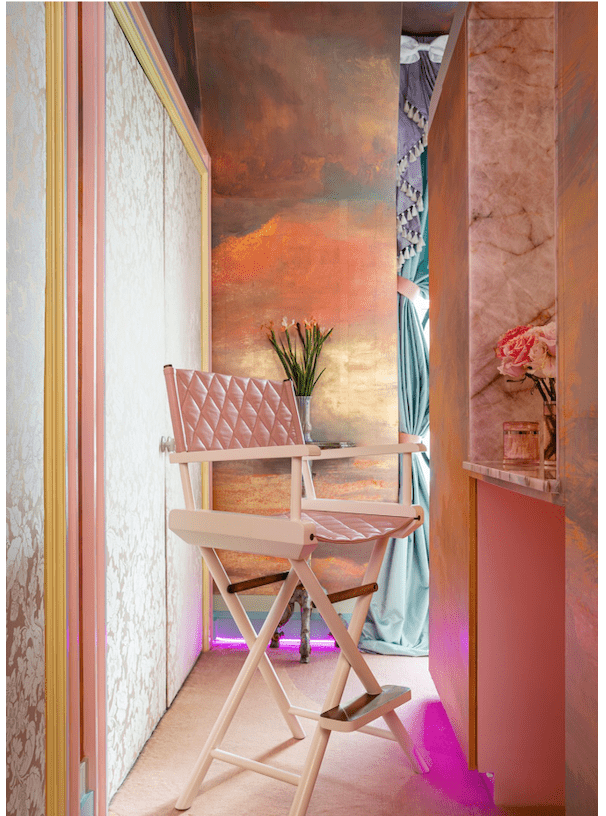
This dreamy bedroom is fitting for any rock star. Not only did she create one of the best dressing areas with a damask fabric for the closet, but the vanity director’s chair would make anyone feel special.
Calla lilies stood tall and confident on a console and the pink flush of flowers for another table charmed all who entered her lovely lair.
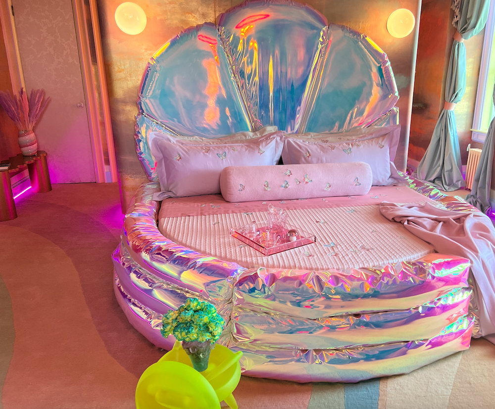
The custom bed by John Pomp Studios was not only futuristic but fun. There’s even a glow-in-the-dark stool that she matched with dyed carnations in cobalt blue and yellow. “I love flowers and always try to use them in fun ways,” says Bikoff.
The candy-colored flooring is part of her collection for Rug Art and also both whimsical and beautiful. Bikoff’s many layers of detail always delight. She truly is the Mae West of designers, invoking the sentiment that “too much of a good thing is wonderful.”
7) David Scott
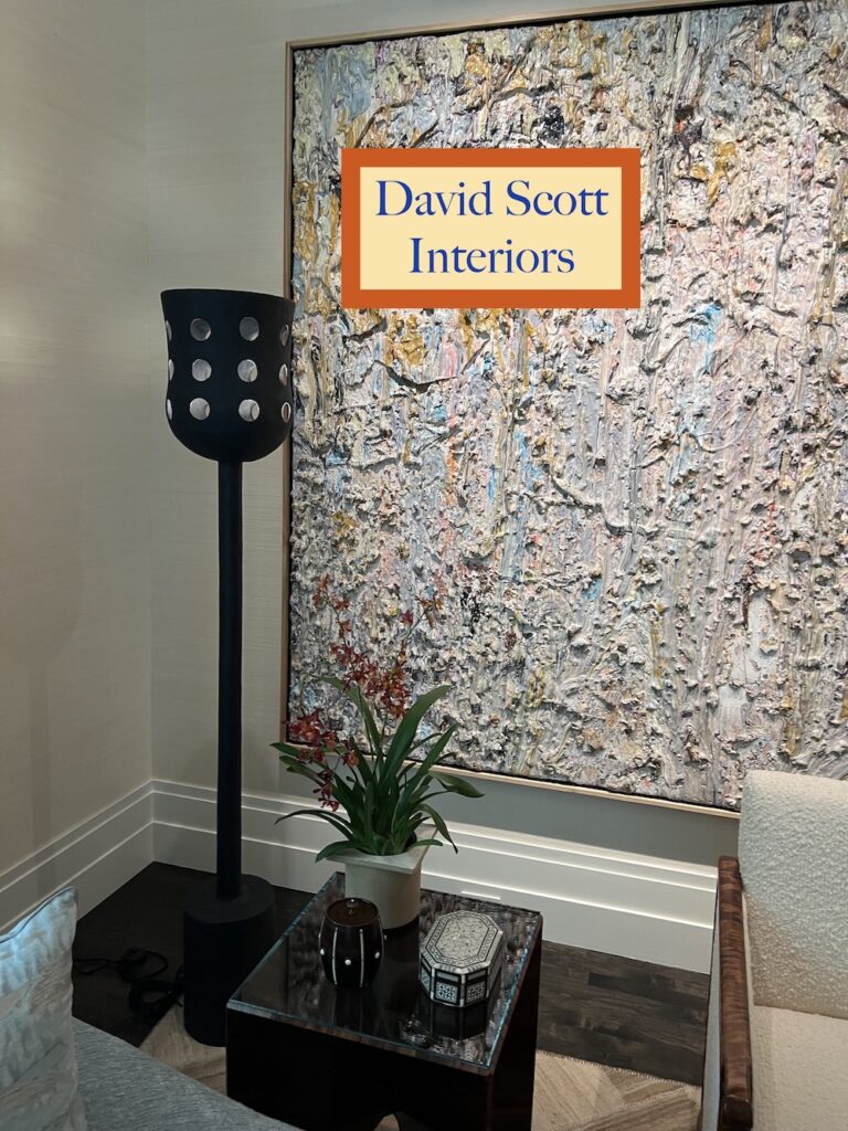
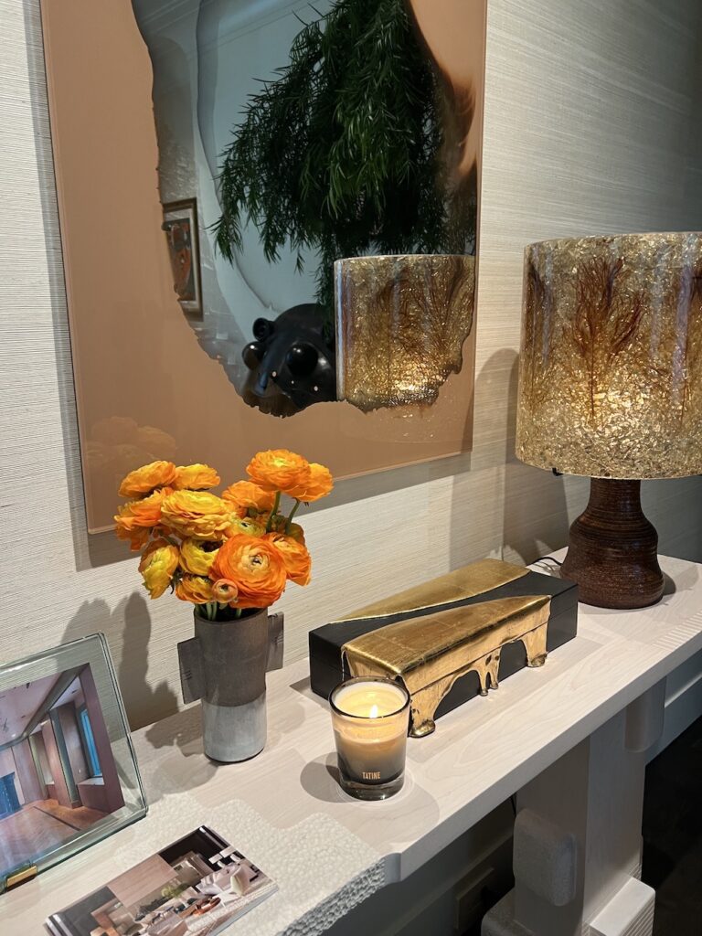
There is a tendency to think of having the same flowers in one room. Veteran designer David Scott shows that this is not true. In one area, he had ranunculus to match the auburn tones and on the table, peonies. With nature providing a galaxy of colors, designers often are inspired by other art pieces to create harmony and beauty. Plus these flowers were also sentimental choices. As he told me, “My favorite flower is the ranunculus but my mother loves peonies.” And yes, he always gives his mom peonies for Mother’s Day.
8) Clive Lonstein
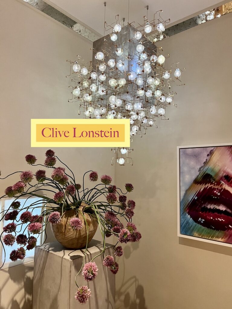
Bet you would never have guessed that this luminous chandelier is actually made from dandelions. Yes, dandelions. Those weeds that even the Chelsea Flower Show 2023 is stating should be viewed as flowers. After all, they are both medicinal, beautiful, and food for pollinating insects. Also notice how he paired the chandelier with monochromatic alliums, which is trending. Lonstein designed the room with the idea of taking extra space in your home to carve out a luxurious experience to celebrate the art of getting dressed up. Really liked the neutral floral fabric that looked like modern peonies in the same shape as the alliums. The dressing room, he says, is a space to showcase one’s favorite things from fashion to art to furnishings. After all – fashion is living art too.
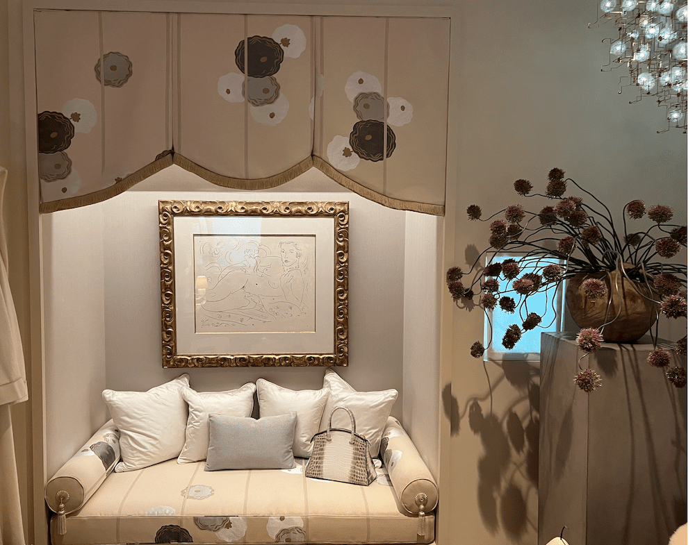
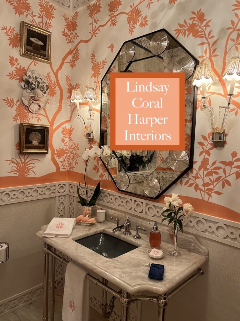
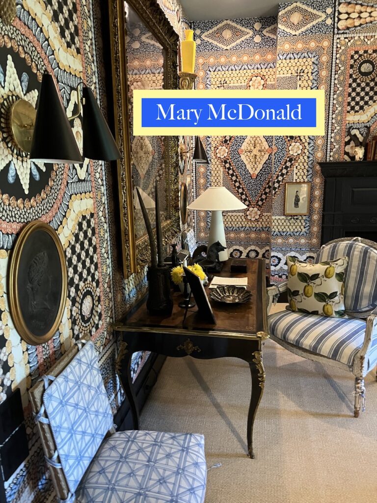
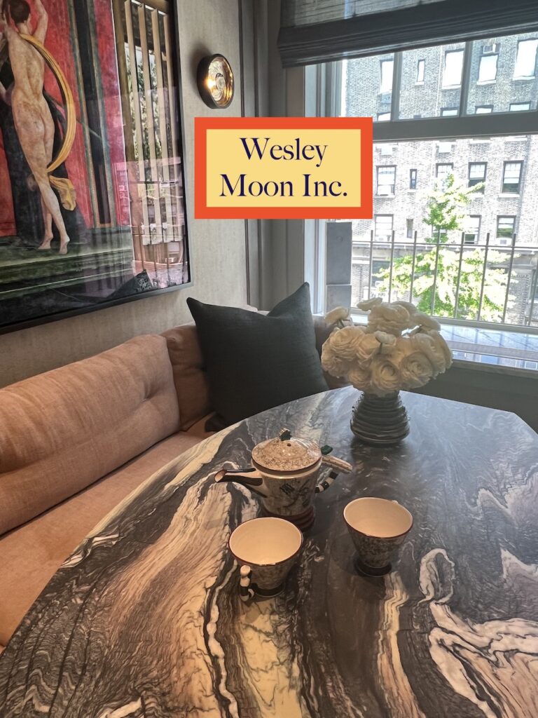
Here are other highlights to enjoy by the following designers at the showhouse.
Jill Brooke is a former CNN correspondent, Post columnist and editor-in-chief of Avenue and Travel Savvy magazine. She is an author and the editorial director of FPD and a contributor to Florists Review magazine.
Photos: Jill Brooke
