
FPD’s Floral Review of Toronto’s Fleurs de Villes Extravaganza
By Jill Brooke
There were so many fabulous floral designs participating in Fleurs de Villes’ latest production that took place in Toronto.
“It felt so good just to work again on a big project,” noted DT Floral & Decor’s Joezel Yumul who worked on his mannequin for 10 days straight before showtime.
In a show worthy of a Hollywood script, Fleurs de Villes, a Canadian-based company that creates spectacular floral pop-up installations around the globe, was asked by the Bloor-Yorkville Business Improvement Association to bring some needed joy and energy to their locale.
Run by Tina Barkley and Karen Marshall, Fleurs de Villes then finds the most respected florists and matches them with sponsors to support these artistic extravaganzas.
In this show, that was the team’s first production since the pandemic, 31 installations were created including 12 mannequins, 3 sculptures. 2 vehicles. 4 doorways and 6 dogs.
Of the mannequin creations, Flower Power Daily appreciated how lush and energetic the florists made their creations.
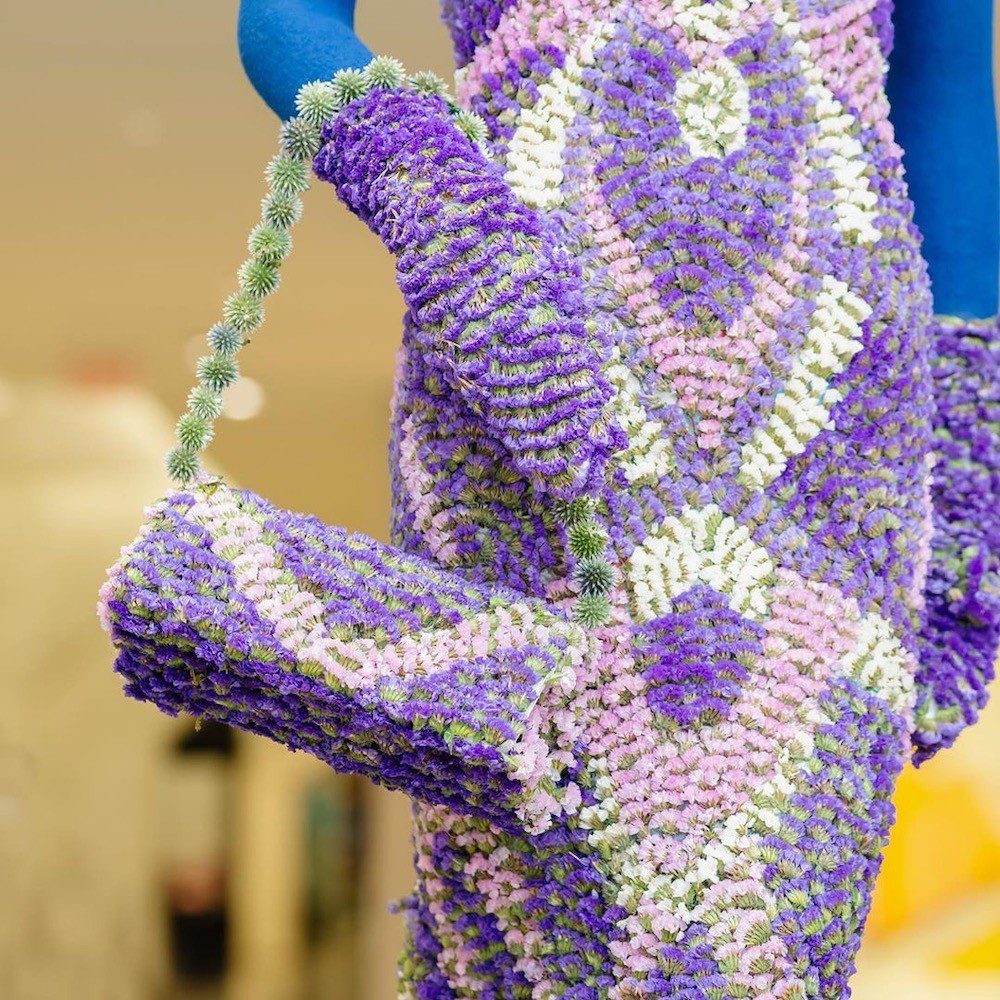
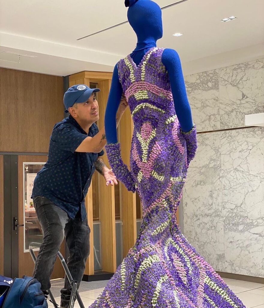
Joazel Yumal used over 1200 stems of Statice in this mannequin sponsored by Fashion Magazine of Canada. The lovely lavender floral gown was a replica of a gown designed by Michael Finkel.
“I only used thistle for the hat,” notes Yumal. “Otherwise it was only one flower.”
Proves how you don’t need a dozen varieties of flowers to create a showstopper. That is surely a 2020 theme right now. Less is more.
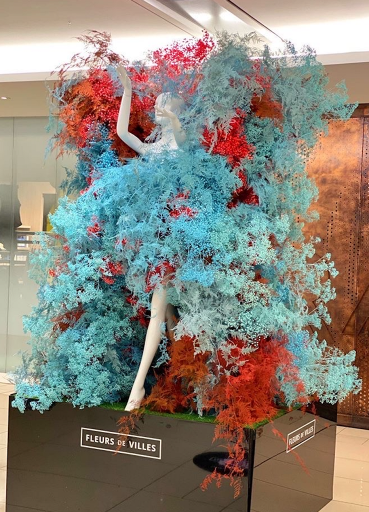
Flowers Time also achieved incredible artistry with its futuristic mannequin. Note the colors of light blue and red – clever combination isn’t it? It is so modern and really worked to convey the futuristic vibe they were going for. If it would have been light pink, the impact would have not been the same and looked like cotton candy. So once again, color is everything.
The Flowers Time team told me they used 1000 stems of baby breath, 500 carnations and 500 plumosus for this creation that looked like a can-can dancer having fun. We all need that positivity right now.
Among the artists working on it were Aleksandr Shashlov, Anastasia Punina, Yury Goncharov, Vitaliy Logvynenko, Galina Vogiatzis, Joel Hatherley and Alina Tacmelova.
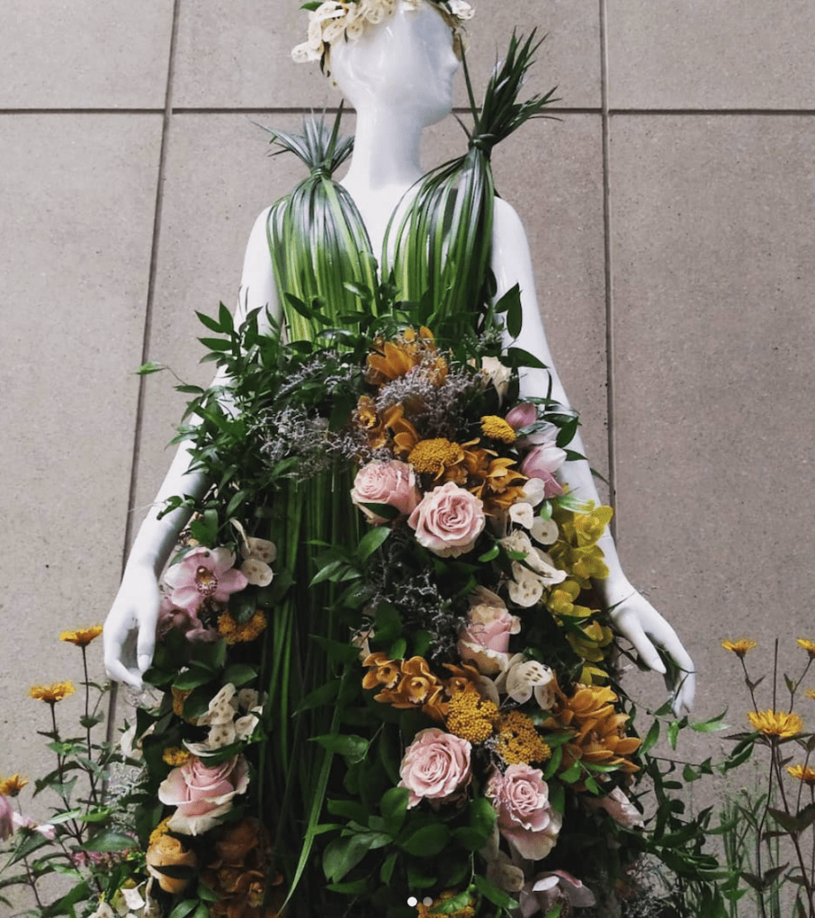
Instead of the future, Periwinkle Flowers decided to visit an herbal essence garden. Their mannequin was enchanting. It was as though the Goddess Hera descended from Mount Olympus in this fresh creative installation. Check out the bodice – made like a blouse you would want to wear -with wispy uplifting detail. The Periwinkle team also had a strip of flowers in pale gold and pink colors as its focal point vs. crowding the skirt. Even the floor had a meadow feeling with echinacea flowers and other visual treats that were airy and welcoming. Everything about this was pitch-perfect and oh so pleasantly dreamy.
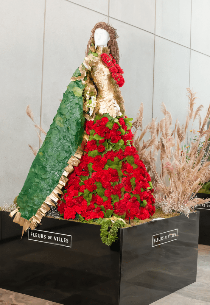
For Rashida Tinwala, the owner and head designer for Hana Floral Designs & Co, her mannequin was inspired by her Pakistani roots.
“It was an Ode To Love, which means the mannequin had to embody the epitome of beauty that a Pakistani bride projects on her wedding day,” she explains. “Gold is the metal of the earth which projects warmth and richness, and red and green are the traditional bridal colors often used by brides. Therefore, we were very clear that we wanted the bride to ONLY be adorned in these three important colors.”
Check out how she used 500 pieces of gold leaves to cover the arm and bodice. The gown had 700 red carnations mixed with 200 red roses and 100 green dianthus and leaves.
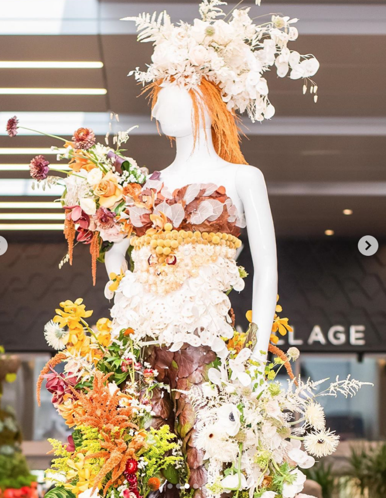
Another favorite was from Snowberry Botanicals. The color palette was almost autumnal but oh so sunny. The team also should get a prize in mixing textures so masterfully. The flowers drape effortlessly and create a feeling of chic country with that extra dash of elegance. Brava. This hit all the right notes. Charming and beautiful. And the variety of flowers made the installation something that people just wanted to savor and study. Definitely a true art piece. Look at the leg with its pressed leaves and how the colors then flow to the flowers. Snowberry Botanicals also didn’t go matchy-matchy with left and right the same colors. Instead, they gave the eye so much to be entertained by which is the mission of the show.
Some mannequin installations were wonderful but missed reaching a top score because of these details.
![]()
At Blooming Flower Bar, the sunflowers used for the sunglasses were a nice touch and they also continued with that sunflower theme on the floor of the mannequin sculpture. And we are fans of roses and protea mixed together which they did for the skirt – since it’s texturally complicated to find uniformity. But too much moss was used in the bodice and arms. It looked a bit like a tree creature. Perhaps if they dangled some flower bracelets on the arm to break up the thick moss, and thinned out the moss, it would have even more impact and color.
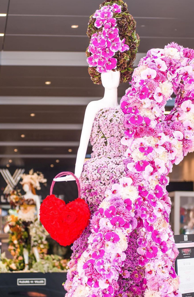
Since I love orchids, couldn’t help but appreciate these hot pink orchids that were used to great effect by Floral Creations. The hairstyle looks a bit Marie Antoinette but in a cool way. Since its sponsor benefits breast cancer research, the choice of the breast cancer pin festooned on the dress was dramatic and symbolic Loved the idea of the heart bag but the color was a bit off. Using a red rose in the middle of the bag was dramatic and well-produced. These are clearly seasoned florists. However, could have paired it with more crimson shades vs. the fire engine red. Or made the bag more interesting with an introduction of another color. Yet her skirt with the flowing shades of purples and pinks and zinnias just popped with personality and style. Here the color choices were so sophisticated and spot on. This should be at any breast cancer benefit because it’s so gorge and creative.
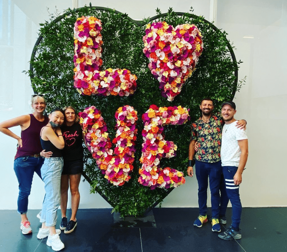
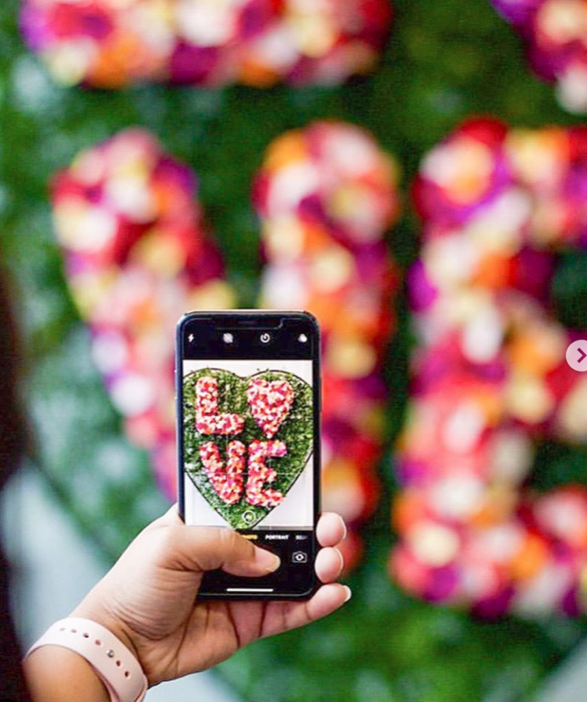
Bruno Duarte of Fresh Floral Creations really hit the mark with his LOVE installation. He made it his own vs. trying to be like the artist Robert Indiana’s iconic sculpture. The scale of the heart-shaped O was more oblong which oozed modernity. If it was a circle, it would have been too cutesie. Well done. His color palate in using yellow, orchids, carnations and roses contributed to the bright, cheerful message. The contrasts with the pale pink and magenta orchids created a playful dance. It’s a sculpture that looking at it just makes you happy. Which is what we all want and need right now.
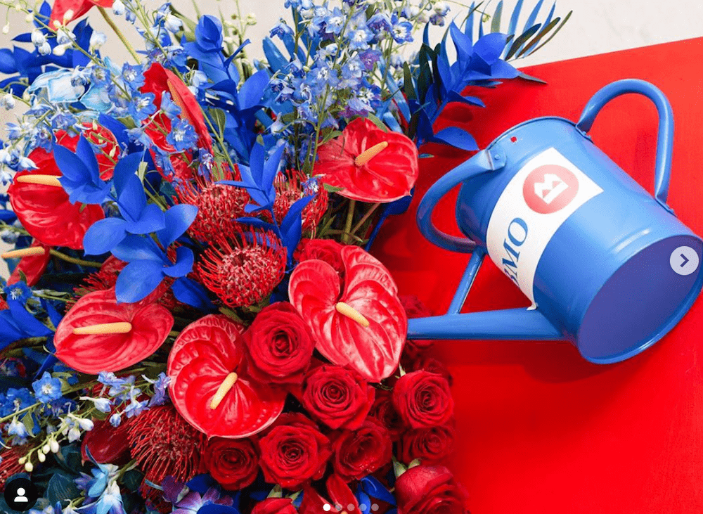
Lena’s Floral Designs also felt the public’s need for playfulness with her sculpture of a watering can and flowers. Loved the red and blue palette that reminded you of colors from Fisher-Price toys. It had a Jackson Pollack feel as though flowers were thrown on canvas and the watering can was left since the blooms had already been happily fed. She used anthuriums, delphiniums, roses, pincushions, Ruscus and cymbidium orchids. Evoked fun, as well as a charming comme ci comme ca quality.
Great branding for Bank of Montreal which is where it was installed. And those are its company colors.
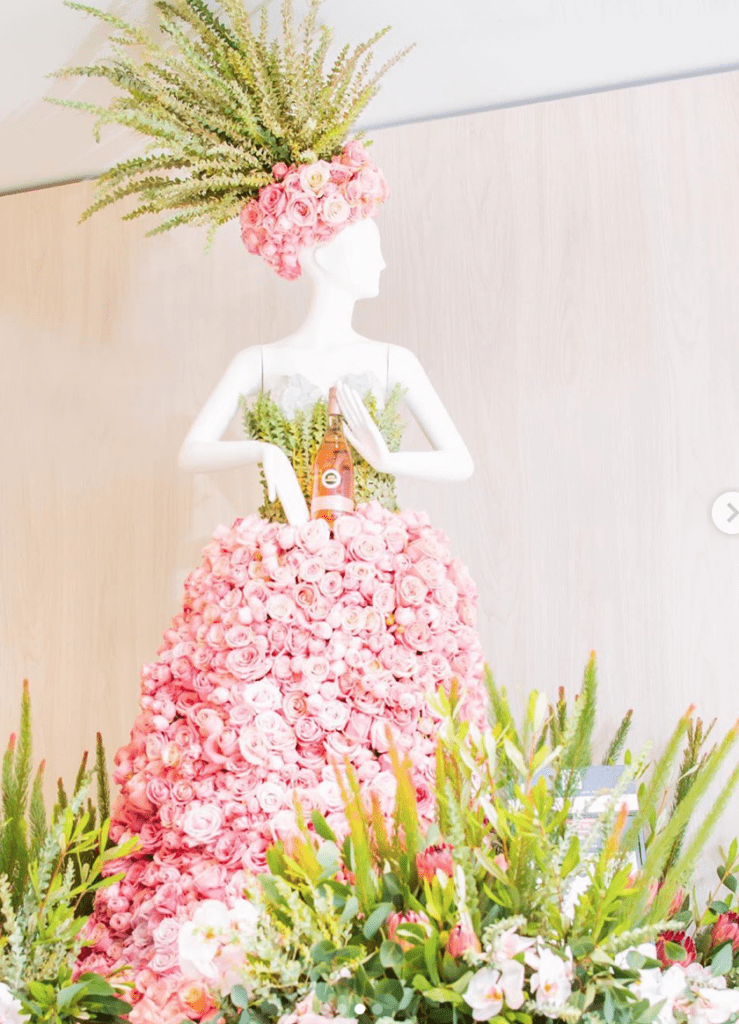
Lena also rocked with her pink-inspired mannequin which was one of our favorites. Matched the color of the Kim Crawford rose wine. that sponsored it. All those pink roses on the skirt made you swoon and she matched it with a eucalyptus colored bodice made of dusty miller greenery. Just lovely. Also liked her flower flash inspiration that Lewis Miller popularized. The orange and yellow colors were so cheery.
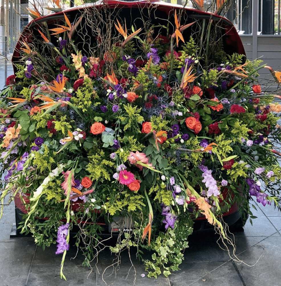
Kudos as well for Flowers by Kata who made us dream about filling a vintage Alfa Romeo car with bunches of flowers and running away someplace. It was the exuberant abundance of all the varieties of flowers that triggered the desire to jump into the car and go somewhere fun. Great use of birds of paradise flowers for height as well as gladiolus – the August flower – to drape downward which made it far more dazzling. There was no holding back here. Because the world is focused on environmental concerns, she dominated the installation with greenery and then accented with perfectly ripe flowers that were in full bloom. If it was too many flowers it would have detoured from the idea of wanting to wistfully visit a wonderful garden.
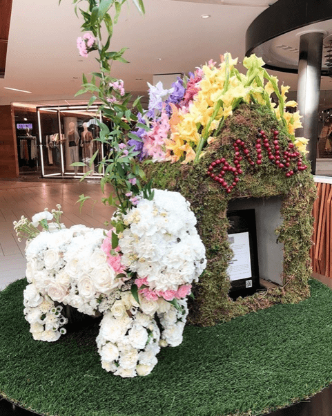
Kata also designed the doghouse while Delightful Floral Design created the dog for this pet-themed exhibit.
What really resonated about Fleurs de Villes installation is how much we miss strolling through shopping centers and gathering with friends for a giggle and cocktail.
Since one can’t have Broadway shows or music concerts – or have large events that showcase floral talent – these pop-up installations become living art galleries that both inspire and delight.
Jill Brooke is a former CNN correspondent, Post columnist and editor-in-chief of Avenue and Travel Savvy magazine. She is an author and the editorial director of FPD.
Share this post: