Floral Trends for 2021 Spotted at NC’s Art & The Bloom
By Jill Brooke
Considering that florists use branches and blooms instead of paint to make memorable art, it is not a surprise that museums and organizations find great success pairing these art forms for popular fundraising events.
Just recently the New Hanover Garden Club organized “Art & The Bloom” where floral artists in South and North Carolina interpreted art donated by the Wilmington Art Association and private collectors.
Oh, how glorious these floral arrangements were as well as impressively creative.
As someone who judges these events, the artists clearly tapped into some trends that anyone can also use for their own home decor. After all, we should be matching floral arrangements with our existing art to create happy environments.
However, before we give you the winners of this contest that other judges chose, all competitions are burdened by subjectivity. Will share what my winner would have been but can see how hard it was for anyone to choose between all these talents.
Floral Trends for 2021 Spotted at Art & The Bloom
1) Using Natural Elements to Create Sculptural Arrangements
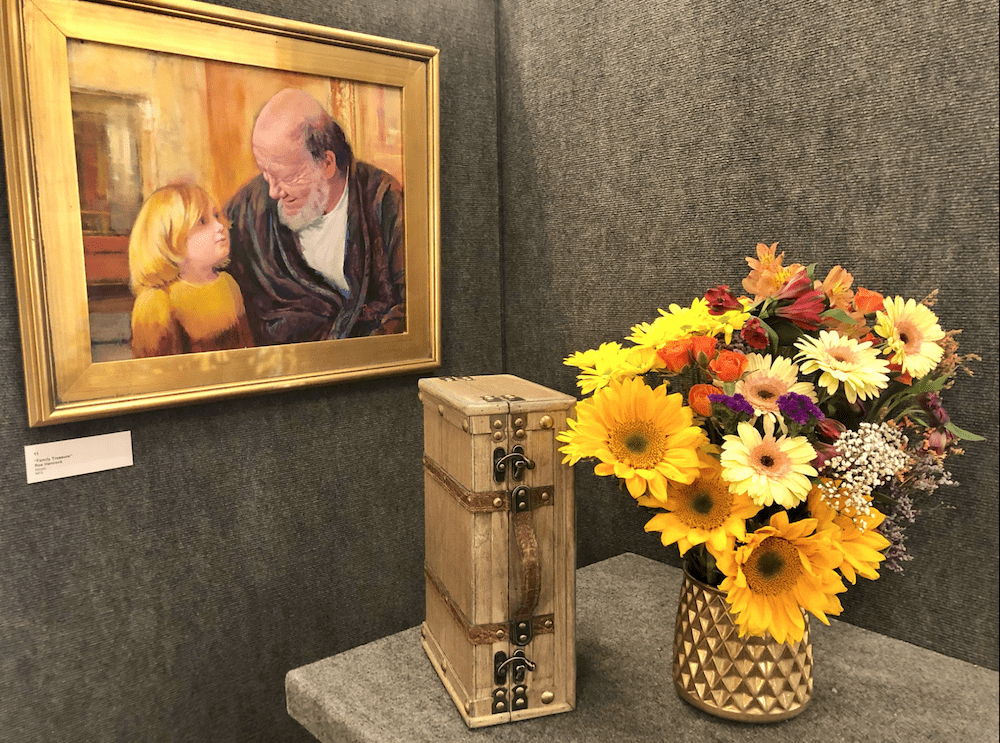
Who can not be charmed by this ensemble by Pat McCartan? Maybe because we are aching for a return to decency and family unity, Pat’s use of this inverted suitcase along with sunny sunflowers and bursts of gerbera daisies just makes you smile and sigh in delight. It also compliments the painting of a grandfather with a child and represents the cycles of life, as flowers are metaphors for as well. While the suitcase uses natural materials, the vase has a modern geometric touch as does how the flowers are gathered and placed. Lines of sunflowers and daisies supplemented by additions of roses and alstroemeria flowers just are perfection. A sensational mix of modern and classic. Surprised it didn’t win a prize because I would have given it an award.
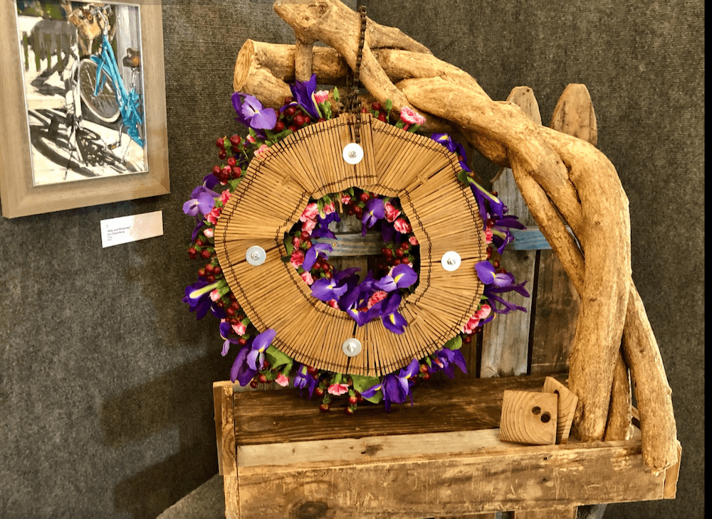
Tod Lengyeltoti of Rock n’ Bloom in Wilmington, North Carolina was looking for “an organic feel” and certainly accomplished it here. He used an old recycled fence for the wooden bench and twisted wisteria for the spokes of the bicycle. How clever. And then he used berries, carnations and iris flowers to add color and intrigue. Just shows you how you don’t need a lot of flowers to dazzle. Furthermore, using natural elements seems to be the rage as also seen for winners at the Chelsea Flower Show and elsewhere.
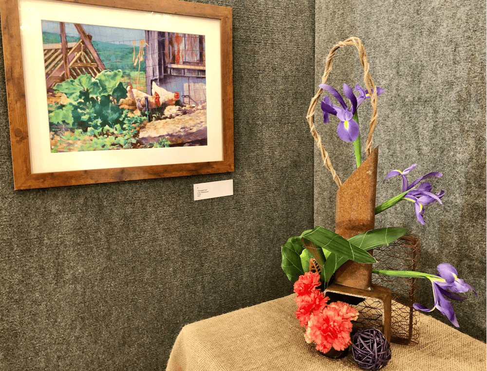
Dot Balkcum used natural rope and natural wood and brass for this arrangement that was both architectural and a nice modern contrast to a traditional painting. Adding the rope ball and metal grid was a modern sculptural touch that worked as was wrapping the leaves with string to match the rope around the iris. Her lines in how she approached where she put flowers were also very effective. The orange cluster of carnations and then the iris shooting out created expansiveness without many flowers.
2) Flowers Using Sculptural Structures Don’t Have to be Plentiful to be Beautiful
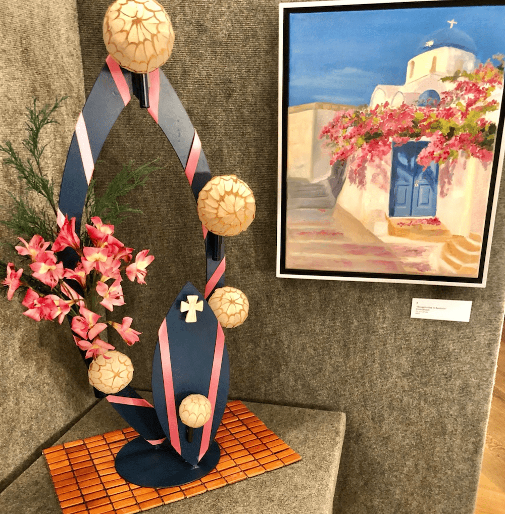
Sunshine Williams of Jacksonville, North Carolina was so resourceful with this arrangement. The painting is of Santorini in Greece – where I was supposed to go for my anniversary in 2020. But now I can feel the experience with this arrangement. Since bougainvillea isn’t in season right now, Sunshine used alstroemeria flowers in pink, rose-colored ribbons on the blue sculpture and cedar balls. Also, like how she put the copper placemat to anchor her arrangement to bring in more color. Modern and classic. Very well done.
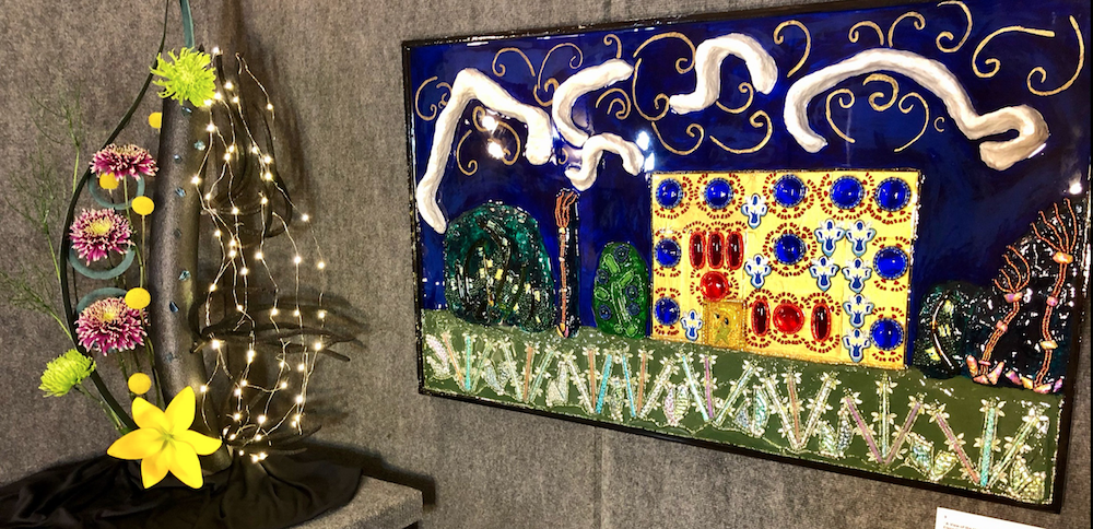
Sherrie Jeffries of Bolivia, North Carolina proved how you don’t’ need many flowers to be creative. The far-right cascade of lights on one side was an inspired idea and then she put bursts of Craspedia and lilies on the left side to create a joyful balance that looked like an extension of the painting.
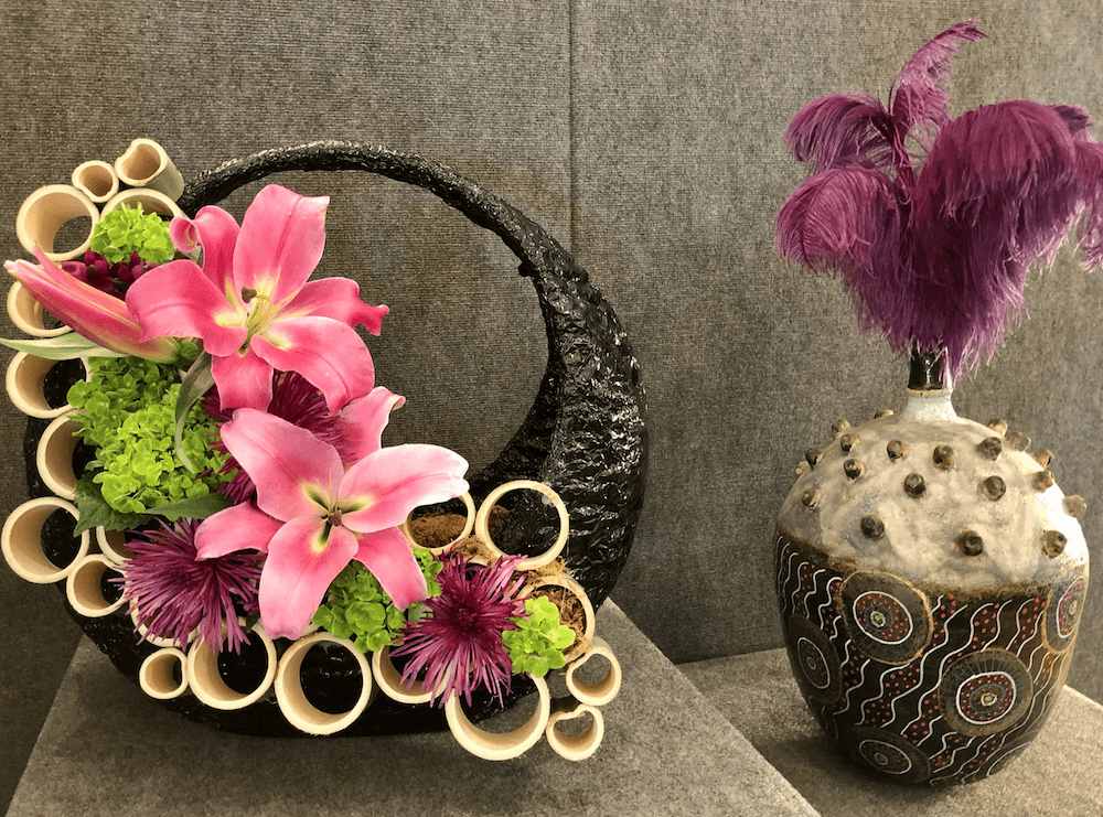
Patti Jacaruso from Wrightsville Beach, North Carolina used just a few Stargazer lilies and bamboo for dramatic effect. Less can be more. Like how she used the purple blooms to match the feathers in the pottery.
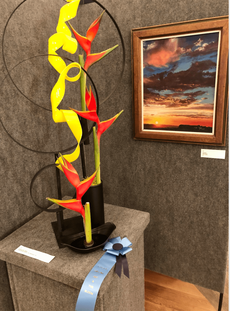
This arrangement by Sharon Van Teyens from New Hanover Garden Club won first prize. While it didn’t have many flowers, it uses a sculptural modern piece and stacked Bird of paradise blooms. The circular shapes of the sculptural elements and swirl of what looks like yellow ribbon complemented the overall arrangement and the dreamy moody emotion of the painting.
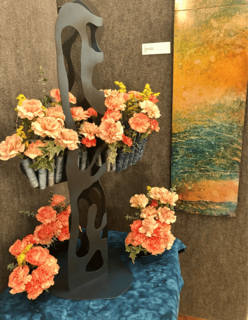
Carnations are the flower for January and used to great effect by Bess Treadwell of Raleigh, North Carolina. Once again, having a sculptural entity to put flowers in pumps up the creative outcome. Good things to invest in for seasonal flower arrangements made easy.
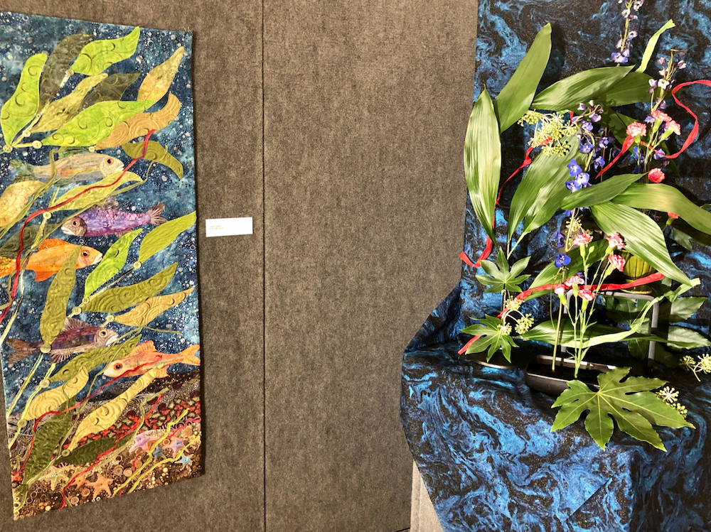
Lisa Jennings of Calabash, North Carolina used Fatsia leaves, seed pots, carnations, and delphiniums to literally create a floral space where these fish would want to go to next. Illustrates how both flowers and paint can create art. The pink ribbon frolicking through her work nicely matched the painting’s flourish as well and created a sense of movement. Her choice of blue fabric replicating water was also inspired. Just really cool. This would have been another selection worthy of a prize from our team for interpreting the art so effectively.
3) Find Similar Color Palettes –
Irene Shea of Willmington, North Carolina used floral colors expertly to match this sculpture. And people at home should realize that you can match sculptures as well as paintings for a dash of drama and beauty in the home. Notice how she draped the arrangement with feathery accessories to mimic an arm. So well done. Nor did she use expensive materials here – using greenery, pincushion flowers and what looks like mums. One detail can turn something from ordinary to extraordinary. Mimicking the arm was truly inspired and brilliantly done.
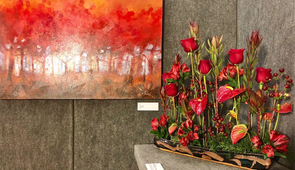
Marge Coner from Ocean Isle Beach, North Carolina used a combo of red roses, berries, and anthuriums for this stunner. Shows how using different shaped flowers in the same color family can create beauty. Her skill was also using alternating heights which showed how you can create a sculptural arrangement without many flowers or colors to achieve excellence. Loved how she used the draping of anthurium to great effect.
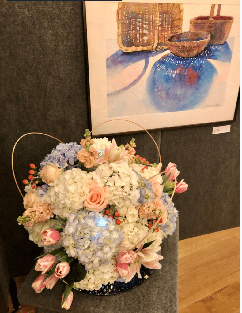
I always respond to pastel palettes because it’s so soothing. Kathy Gresham from Wrightsville, North Carolina used hydrangeas as a circular enchantment and then followed that with twine in a lovely way. Notice how those multi-colored tulips are just bursting with joy along with the blush pink snapdragons. Smart that she didn’t take the basket shapes for inspiration but the undertone of the circles in the painting. However, the twine does look like a basket handle. Also, flower lovers, do note how the flowers didn’t have to be in full bloom. It’s as though they are about to burst open which creates an arrangement also of anticipation.
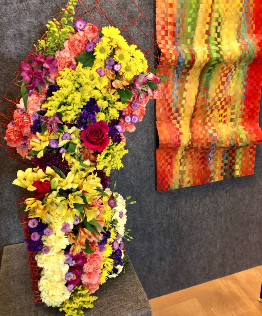
Kim Cruz’s work is truly a pleasure to look at. This tapestry with its cascades of carnations, daisies and roses is expressive and harmonious art for which she deservedly won third prize. Note the red frame that the artist worked so hard on – it looks like a separate painting. I would especially like to highlight how cleverly she placed the bright rose not in the very center, but slightly above and to the right, which makes the eye move involuntarily across the tapestry. If you also appreciate good art and have the urge to switch to something completely different, we recommend you download the Sky247 app https://sky247india.com. There you will find not only gambling games, but also many other interesting opportunities for a pleasant pastime.
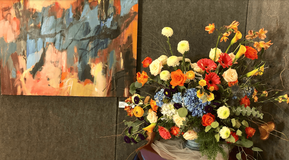
You can tell Cathy Poulus from Willmington, North Carolina is also a painter. This arrangement is just a spray of colors and also appreciate how many different flowers she used for this beautiful display. She also expertly weaved her display with different heights very effectively. The eye dances all over this arrangement that has thistle, coral ranunculus, blue hydrangeas, purple daisies and calla lilies. It’s a classic design on steroids which works so well with the modern painting. Would have been even more spectacular if she put some more blue flowers high on the far right. But not quibbling over something so pretty.
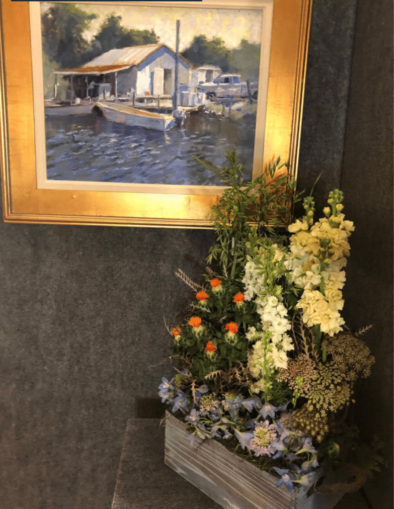
Suzanne Tarry of Apex, North Carolina got my attention for using subdued colors in her arrangement to match this painting. It evokes a reflective mood that works so well together. The teeny weeny bit of pop comes from the orange – and she chose small blooms to not make a big statement – which also matched the roof of the painting. Subtle can be sublimely divine. Alone, this arrangement may look dull. But not when connected to the painting.
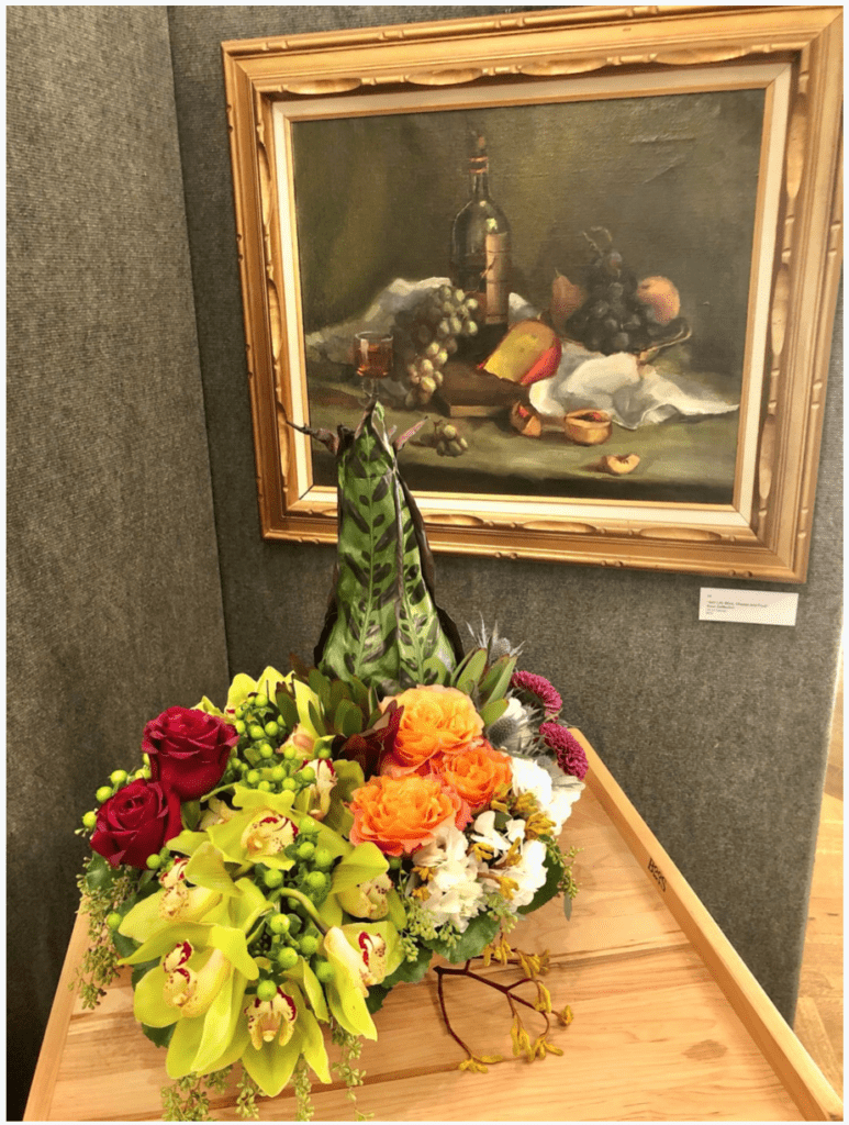
Vicki Boileau of Visons by Vicke Event Planning shows how colors don’t have to be matchy-matchy to be effective. The indentation of the cheese and a descending tray of goodies is illustrated by the orchids. She didn’t choose an orange or yellow color but it complements the overall look. Also, this arrangement was completed with the addition of the tall greenery to illustrate the wine bottle. The draping here is what makes the arrangement.
4) Accessorize with other items in various shapes to create more interest
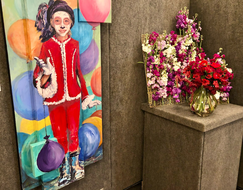
Brittany Wells Brown from Verzaals Florist interpreted the word of Mary Austin’s “Happy.” The florist matched the bright clown-like red colors with the selection of red ranunculus and anemones along with other shades. Good choice to use magenta to compliment the purple in the balloon of this mime artist. Brown says she was looking for “joy, childlike whimsy and fun” and certainly achieved that goal. Nice touch in adding the top right blooms higher than the main design to convey a feeling of a balloon.
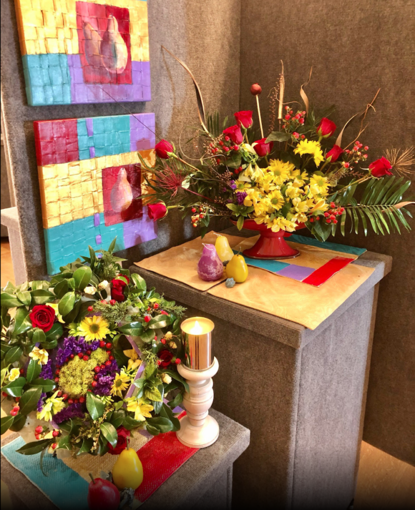
Andrea Shead of Coastal Garden Club in Southport, North Carolina created such an exuberant arrangement here. She matched all the colors of the painting and wisely accessorized with fruit candles to create a wonderful overall effect. The placemats were inspired and good for her to find ones that matched so well. And why just have one arrangement? She used two arrangements to complement this art and didn’t make them matchy-matchy. Just hit all the right notes.
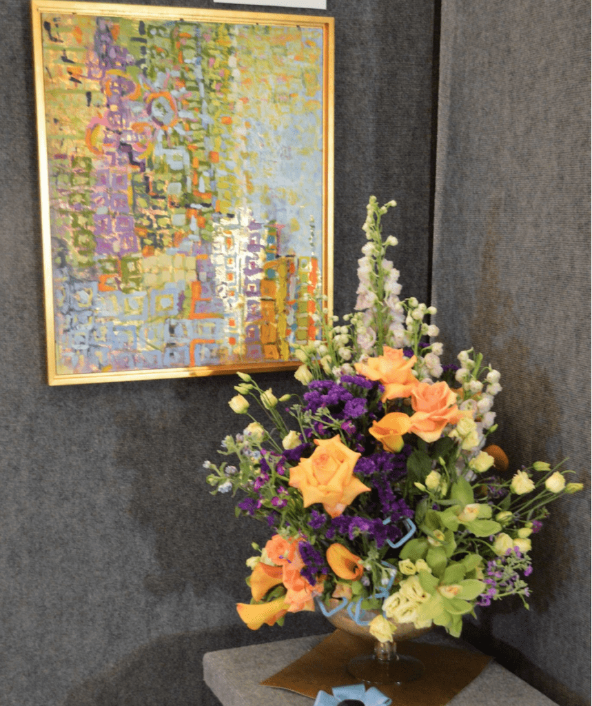
5) Interesting Vases Can Make It Easier For Big Impact
![]()
Roxanne Thompson from Willmington, North Carolina won hearts with this arrangement. Love how the smoky vase complements the painting’s frame as well as the fabric she found to add dimension to this design. Lilies, roses and the purple iris match so nicely with the painting and she used the fabric to bring in the blue of the painting. It has an abstract feel when paired with the painting – though would have been more classical in design without the painting. It’s all about layering, isn’t it? This won People’s Choice as well as Best Use of Color.
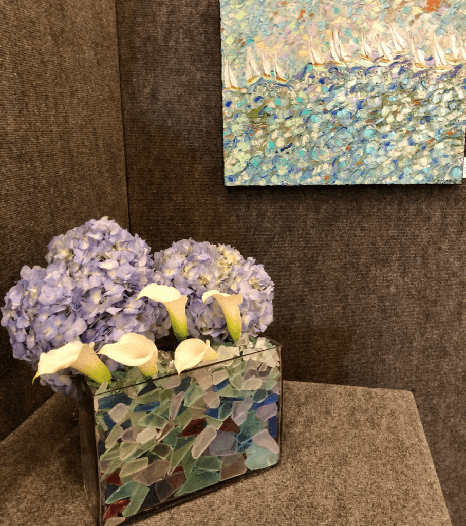
Seeing this painting, Melanie Wyatt just thought about “water and waves.” Therefore she found sea glass to put in a vase and only needed a few calla lilies and soft lavender hydrangeas to complete the look. With a great vase, you don’t need a lot of blooms for a great look.
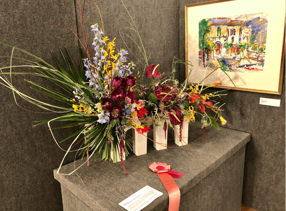 Noel Morris, from Sweetgrass Southern Market, in Oceanside, North Carolina won Second Prize for this arrangement. Notice how she used four similar vases lined up to create a modern look that also symbolized the building exteriors of the painting. Smart use of vases. Also am a fan of how she used the greenery on the left to illustrate a tree. Good use of the deep garnet rose as well as the anthuriums to add pizazz to the yellow blooms. She also draped her flowers in a clever way that created so much intrigue and beauty.
Not a surprise that hundreds of people visited Art & The Bloom event that took place at the Blockade Runner Beach Resort.
“We look forward to the many good projects the New Hanover Garden Club will be able to support to give back to our community,” noted Barb Bittler, the co-chair of the event, who agreed that this year’s entries were particularly fantastic.
The proceeds for Art & The Bloom benefit gardening projects for nonprofit organizations and scholarships for students including helping essential workers, restoring storm-ravaged gardens at two churches and planting a pink ribbon garden at the Lower Cape Fear Hospice.
Good times and good deeds are always a great combo just like art and flowers.
Jill Brooke is a former CNN correspondent, Post columnist and editor-in-chief of Avenue and Travel Savvy magazine. She is an author and the editorial director of FPD.
Photo Credit: Scott Bittler
Share this post: